Posters that entertain
Historically speaking, nothing sells a social event like the right poster. Entertainment posters were designed to do just that.
Whether it’s a film, a festival, a fair, or a gig, posters can be emblematic of what an event is about and define its overall character.
Here, we take a look at 12 of the most inspiring entertainment posters from throughout history
Duclerc - Alfred Choubrac circa 1890
The 20 or so years spanning the mid-1880s to the early-1900s were a pivotal period for the development of posters, with this unique art form proving ever more popular thanks to the fact that it was widely used for commercial means.
Alfred Choubrac was one of the many famous French artists who turned their attention to poster art in order to make a living.
His 1890 ‘Duclerc’ poster, which came during the height of the belle epoque period, was used to promote the theatre and cabaret actress of the same name, Mademoiselle Marguerite Duclerc.
Its depiction of the woman as bawdy, vivacious, and colourful was an important part of selling her to a viewership, who were increasingly becoming used to seeing highly sexualised posters.
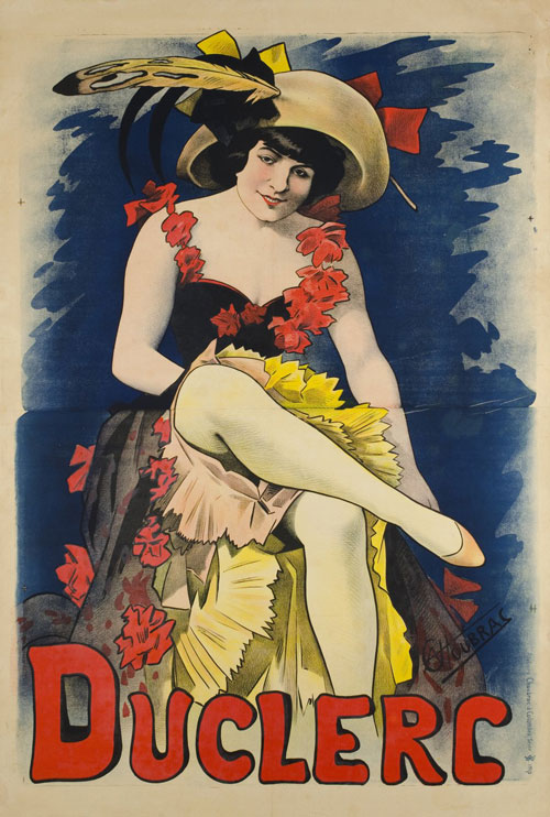
Duclerc – Alfred Choubrac
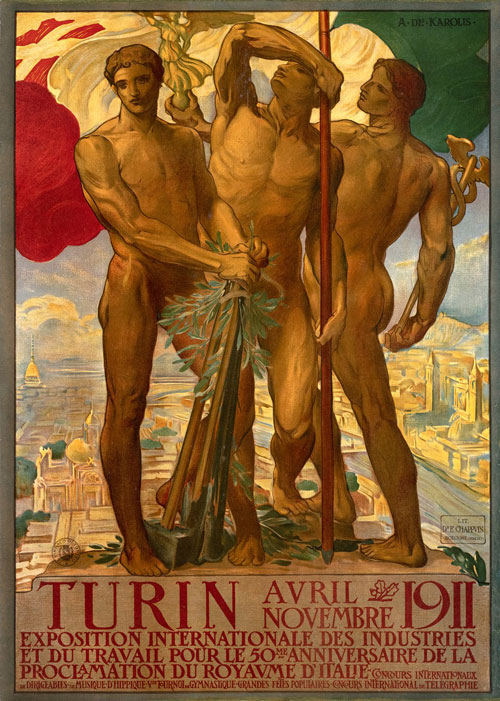
Turin 1911, Exposition internationale des Industries et du Travail – Adolfo de Carolis
Turin 1911, Exposition internationale des Industries et du Travail - Adolfo de Carolis 1911
This evocative poster was commissioned for the Turin International World’s Fair, which took place in 1911.
At this particular Fair, there was a strong focus on the arts, with hugely popular Art Nouveau pieces taking pride of place.
De Carolis’ poster stresses classical – and national – elements of Italian and Roman history, symbolism, and mythology.
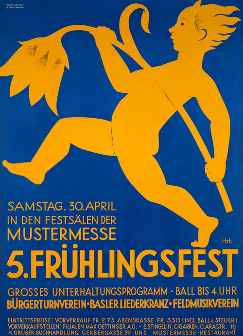
Frühlingsfest Mustermesse - Beni Hunziker 1925
Hunziker’s poster was commissioned for the Spring Festival Fair, a major event on the German calendar.
With a wonderful, minimal economy and deep colours – verging on the Art Deco style of his later work – Hunziker captures the vast, intangible, incorporeal spirit of ‘spring’ with a singular image.

Frühlingsfest Mustermesse – Beni Hunziker
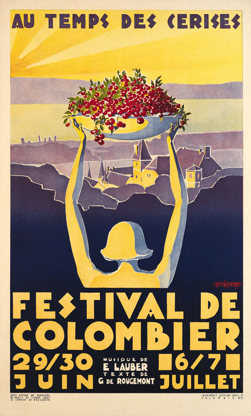
Festival de Colombier, Au temps des cerises – Rizzera
Festival de Colombier, Au temps des cerises – Rizzera circa 1929
Rizzera’s eye-grabbing poster served as a complement to the popular show ‘Au Temps des Cerises’ by Gilberte de Rougemont.
The term ‘Au temps des Cerises’ literally translates as ‘At the time of the cherries’ and it is a well-known phrase in French-speaking areas, roughly meaning “At a time in the future when the social and economic situation will be better.”
This explains the picturesqueness of the poster. And while the phrase itself has strong political undertones, Rizzera eschews them here, focusing purely on bucolic imagery.
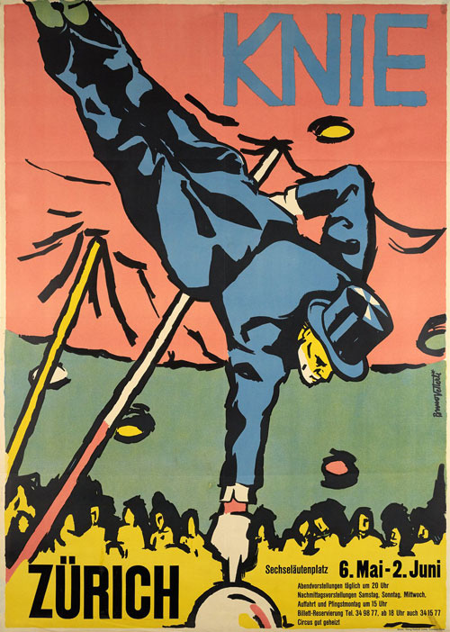
Knie, Cirque Knie, Zürich - Bruno Vetterli 1955
Vetterli’s poster for the Swiss circus owes a lot to pop art, even comic book art, in its style.
As this is the circus, colours need to be primary (literally, primary) and they need to dazzle and pop.
With this poster, you truly get a sense of the acrobat performer taking centre stage, while a sea of faces look on expectantly in the near-darkness.

Knie, Cirque Knie, Zürich – Bruno Vetterli 1955
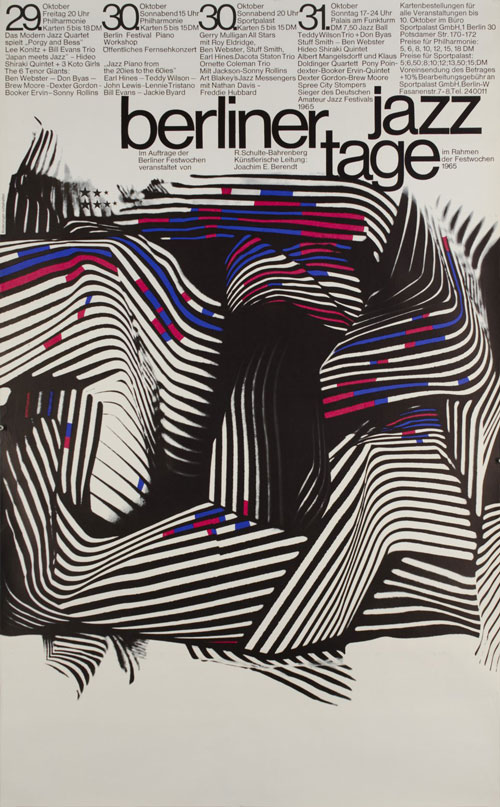
Berliner Jazz Tage 1965 – Günther Kieser
Berliner Jazz Tage 1965 – Günther Kieser 1965
German poster artist Günther Kieser would have been well aware that jazz music prided itself on its unpredictability, which helps explain this enigmatic poster.
Beautiful – and subtle – it owes a lot to psychedelia, as well as to modernist architecture.
But beyond that, look also at the odd geometry of the lines in this poster. Are they music staves? Twisting and turning in an Escher-like fashion to indicate the free-flowing and chaotic nature of jazz music?
Kieser’s genius always keeps you guessing – and asking questions.
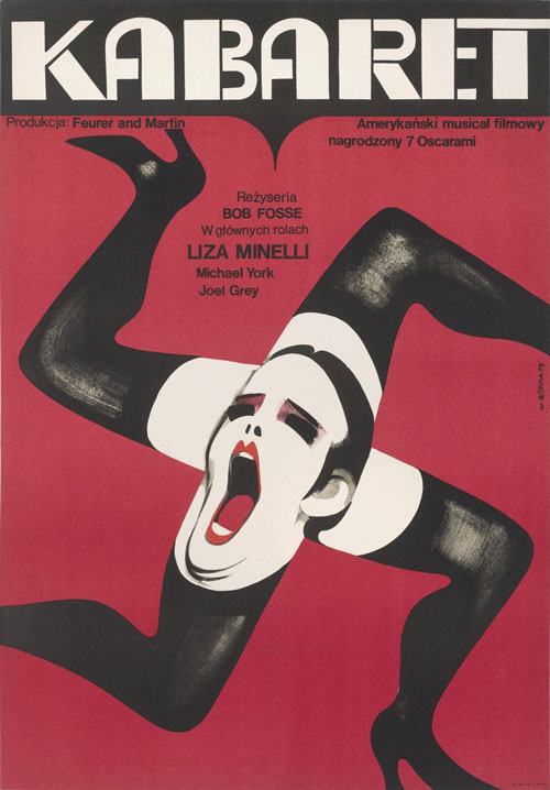
Kabaret – Wiktor Górka 1972
Górka’s provocative poster features a red background, white photography, and a female head singing (or shouting) from the centre of four burlesque-stockinged legs, which themselves are shaped like a swastika.
For a musical all about cabaret, sex, suggestiveness and Nazis, it’s fair to say that Górka understood the assignment…
He took a bold artistic move, and it paid off in dividends.

Kabaret – Wiktor Górka
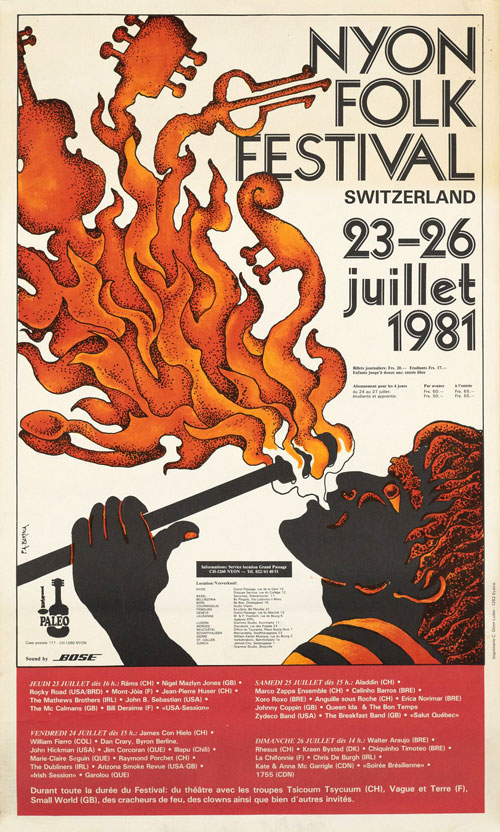
Nyon Folk Festival, Switzerland – Pierre Alain Bertola
Nyon Folk Festival, Switzerland - Pierre Alain Bertola 1981
For those in the Nyon area of Switzerland, the Nyon Folk Festival has held a special place in their hearts for almost 50 years – and has emerged as the country’s biggest open-air festival.
Bertola’s beautiful, richly-toned poster – depicting a firebreather whose flames become folk music instruments – successfully captures the ribaldry of the festival. The economic use of colour, the contours of the flames, and the understated but sharp typography, all make this poster stand out in a really beguiling, memorable way.
Carnaval Barcelona 1982 – Javier Mariscal 1982
Barcelona’s Carnaval is both a high-spirited and colourful affair, with literally hundreds of different events taking place across multiple days, in a city of over 5 million people.
Mariscal, perhaps, appreciated that the joy of Carnaval can’t easily be explained with a single image, which is why his expressionistic, colourful, bizarre poster choice for the event works so well.
The androgynous red-dress-wearing figure in the poster says a lot about the event’s spirit, without really saying anything at all.
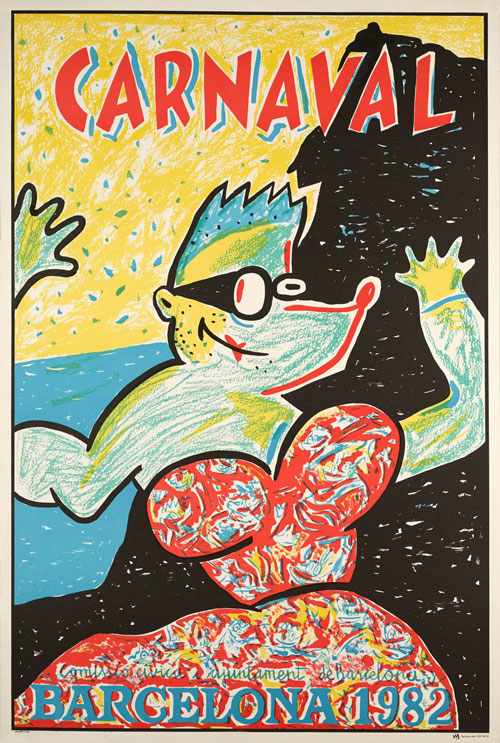
Carnaval Barcelona 1982 – Javier Mariscal
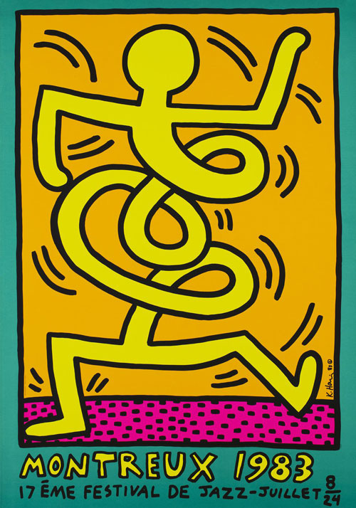
Montreux 1983, 17ème festival de jazz – Keith Haring
Montreux 1983, 17ème festival de jazz - Keith Haring 1983
As with Kieser’s take on the unique nature of jazz with his ‘Berliner Jazz Tage’ poster, so too did New York-based artist Keith Haring eschew any depictions of instruments or musicians in his poster. Instead, he went straight for the throat and capture the feel of this unique genre of music.
For his poster promoting the Montreux Jazz Festival in 1983, Haring created a wonderfully quirky work of art, in which an animated human appears as an unloosened spring, swaying to the music.
Haring’s brilliant animated style probably needs no introduction for art lovers – he was one of the most famous street artists of the 1980s American subculture, and his work has left a long legacy.
25th New York Film Festival, Alice Tully Hall –Sol Lewitt 1987
American artist Sol Lewitt was obsessed with geometry in his work. In particular, his work reveals a playful curiosity for how lines, shapes and colours can be both rigid and fluid at the same time.
In this poster, created for the 25th New York Film Festival, Lewitt offers a minimal design – with kineticism being the key to understanding it.
As our eyes move, the poster does too – the lines expand, the lines contract, the white space fills out with colour. It happens in your mind, the same way we process everything that happens in a motion picture.
Lewitt leaves his work open to interpretation, but when you look at this poster, you can easily imagine a camera roll at the start of a film, or a director’s clapperboard waiting to clamp down and yell ‘Action!’
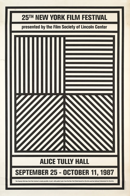
25th New York Film Festival, Alice Tully Hall – Sol Lewitt

Monde du cirque, Geneve 2010 – Werner Jeker
Monde du cirque, Geneve 2010 - Werner Jeker 2009
Swiss graphic designer Werner Jeker is proof, if it were needed, that entertainment and event posters could still surprise, dazzle and compel audiences, even in the fast-moving, digital world of the 21st Century.
His design – which depicts a tightrope walker as viewed from below, along with arresting typography – is an original, surprising take on the standard, cliched circus poster style. Photography is utilised, but it’s done so sparingly, with geometric shapes being they key to what makes this poster so visually compelling.
Entertainment posters grabbed the viewers attention
History has shown that posters can not only promote all manner of events – but help communicate their theme and unique identity.
The best poster artists of the last 100+ years are often those who don’t stick to any rulebook for their designs, with many believing that style, eye-grabbing imagery, and originality all work better than anything else.
Judging by the creativity of the posters here, we’d be hard-pushed to disagree…
