How poster art has moved with the times
If the first 50 years of the FIFA World Cup were marked by major upheavals (World Wars, Cold Wars, cultural revolutions, and everything in between), the next 40 years were marked by how rapidly this tournament grew and how quickly it became a worldwide event.
More money was being invested in football than ever before, and the World Cup was rivalling the Olympics in terms of the economic, commercial, tourism, and marketing opportunities it offered to host nations.
At the same time, almost every household had a television by the 1980s, while the decades which followed saw the emergence of the internet and social media.
Against this commercialised backdrop, World Cup posters from 1982 onwards took on new functions.
Let’s take a look at each of their stories:
1. Spain, 1982
On its first occasion hosting the World Cup, the newly liberalised Spain (which was just a few years on from the grip of General Franco’s rein of fascism) leaned into its history of surrealist art for its poster.
Artist Joan Miró designed a wonderful poster, which captures the colour, chaos, movement and dynamism of the World Cup – without having to fall back on a ‘realist’ depiction of the sport.
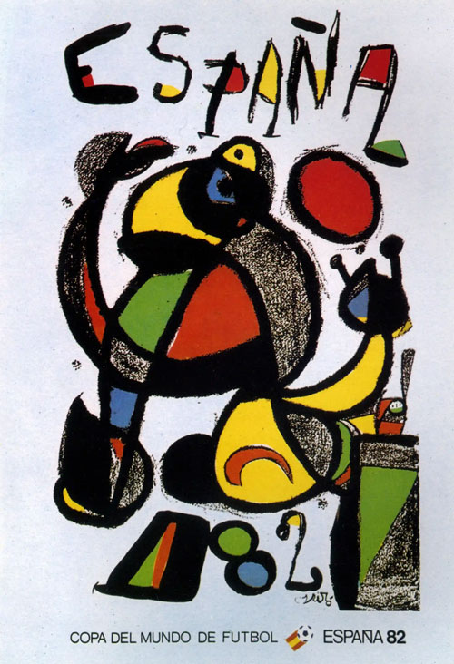
Spain, 1982 – Joan Miró

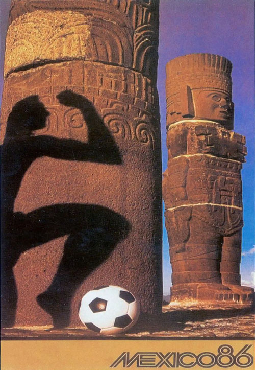
Mexico, 1986 – Annie Leibowitz
2. Mexico, 1986
Just 16 years after first hosting the tournament, the World Cup returned to Mexico.
The posters for this tournament were designed by non-other than renowned American photographer Annie Leibowitz (the first time a photographer created a World Cup poster design).
Leibowitz sought to highlight the host nation’s Aztec heritage, with a quirky photo that features the shadow of a man, a football, and some ancient Mexican monuments.
3. Italy, 1990
Designed by Alberto Burri, the Italy 1990 poster has the Colosseum at its heart, with the black-and-white image of the classic Roman monument giving way to the bursting colour of the football pitch and national flags.
The poster was designed along with five other unique posters and plenty of advertising, as Italy placed a strong emphasis on marketing for this event. For this same tournament, the blocky, tricoloured mascot known as ‘Ciao’ was created, and football stickers took a new prominence, becoming important collector’s items.
The verdict? With its barrage of imagery, postering, and marketing, Italy was looking to reaffirm itself as one of the footballing nations.
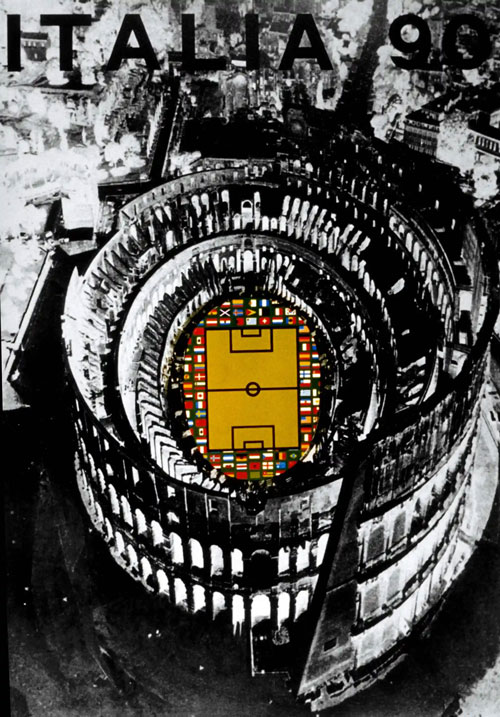
Italy, 1990 – Alberto Burri
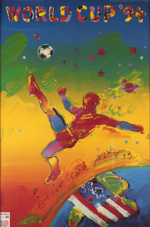
USA, 1994 – Peter Max
4. USA, 1994
Designed by artist Peter Max, the USA’s contribution to World Cup posters is an incredibly interesting one.
Max makes full use of his colour palette for this image, which features a striker soaring above the earth, seemingly in the midst of doing a bicycle kick. There’s atmospheric swirls, stars, planets and galaxies in the background, while down on earth, we see the American flag depicted over the USA’s geographical landmass.
So what are we to make of it? It’s bold, it’s aspirational, it’s football-oriented, and it speaks to American national pride. It’s about as good an all-rounder as you could ask for.
5. France, 1998
France’s ‘Coupe De Monde’ poster features a dizzying kaleidoscope of colour, with a stadium depicted from a bird’s eye view, and ‘France ‘98’ written out in a scrawled typography.
Whatever the artistic intention here, the chaotic France 98 poster is perhaps sadly one of the least memorable of the World Cup posters.
But, to be fair, it isn’t entirely the fault of the artist. By 1998, host cities in each World Cup were starting to present their own imagery and posters to assert a sense of regional pride. Meanwhile, the simple France 98 logo – with its red, white, and blue football and splash of blue colouring – was great for TV graphics, newspapers, and the ever-growing online arena. The result was that this poster got squeezed out of the visual space.
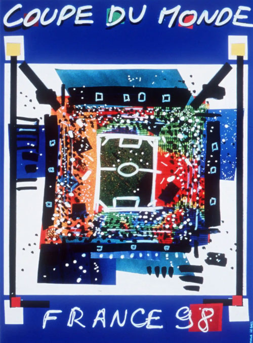
France, 1998
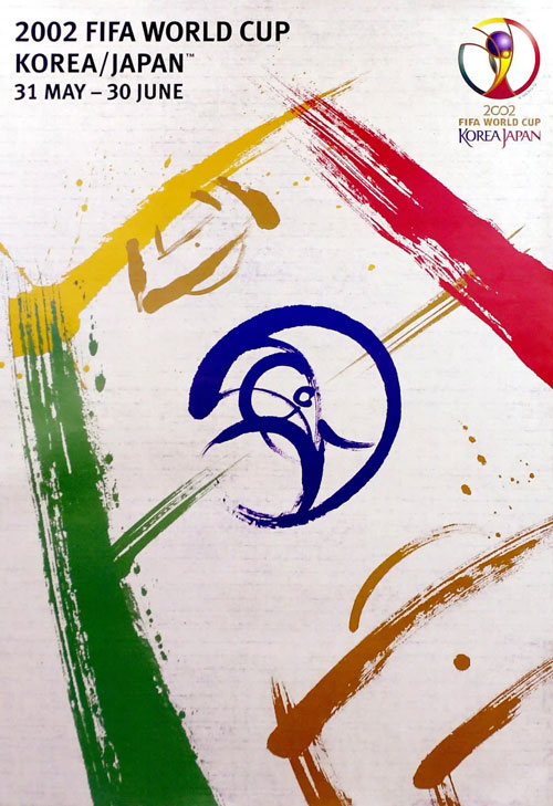
Japan & South Korea, 2002 – Byun Choo Suk (Korea) & Hirano Sogen (Japan)
6. Japan & South Korea, 2002
The first-ever World Cup with two hosts, the 2002 World Cup saw a collaboration between two poster artists – Byun Choo Suk (Korea) & Hirano Sogen (Japan).
The broad brush strokes, intelligent uses of colour, and brilliant minimal rendering of the World Cup Trophy in the middle all make this an incredibly compelling poster. In fact, this was the first time that the trophy was actually depicted in a World Cup poster.
20 years on, it’s fair to say that this poster has withstood the test of time.
7. Germany, 2006
In an age of fast-moving media, endless TV coverage, and the emergence of the internet, World Cup posters in the early 2000s appeared to find it necessary to become more minimal, more clear-cut, and more focused on logo-building and recognition.
This might explain the simplicity of the poster for Germany 2006. The image literally suggests a star-studded football tournament. But the real story is in how prominent the ‘laughing footballs’ logo is in this poster.
Branding, in this case, is much more of a concern than an ambitious poster.
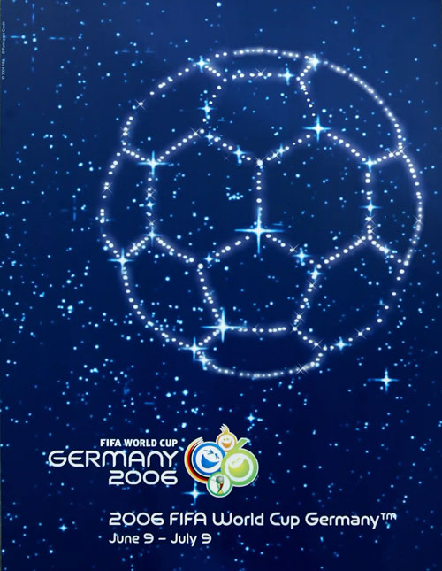
Germany, 2006

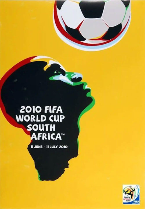
South Africa, 2010
8. South Africa, 2010
All eyes were on Africa in the summer of 2010, as the nation of South Africa hosted the first-ever World Cup on the continent.
The tournament was billed as promoting the opportunities and advancements of African culture in recent years, so the poster is very fitting. It features a young man looking hopefully at a football above his head, as his bust takes on the geographical shape of Africa. The poster also subtly incorporates the colours of the South African national flag. Brilliant, simple, subtle, and memorable.
9. Brazil, 2014
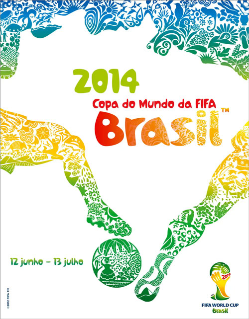
The first World Cup poster to be unveiled via tweet (from the official FIFA Twitter account), the Brazil 2014 poster represented yet another a new chapter for the international tournament.
The poster is vibrant, colourful, beautifully designed which ensured that it went viral as soon as it was released to the digital world. In particular, look at how the tropical depictions at the top of the image, and the legs reaching out for the ball at the bottom, actually form a map of Brazil in the white space.
This is what you call inventive, artistic marketing…

Brazil, 2014

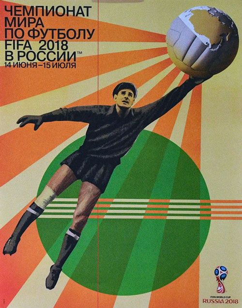
Russia, 2018 – Igor Gurovich
10. Russia, 2018
The poster for the 2018 World Cup was designed by renowned Russian artist Igor Gurovich, and features Lev Yashin – an acclaimed Soviet keeper – as the central figure being depicted. It employs a distinctive Soviet Constructivist poster style.
Commenting on the poster, Gurovich himself said: “The style of Soviet post-Constructivist posters from the 1920s and 1930s, their unique visual language, a new, fresh poetry of figurative images, became one of the most important and revered elements of Russian culture.” It seems appropriate, then, that Gurovich would bring that approach to the first tournament to be held in his home country; this is a poster that gives primacy to Russian heritage, art, and sporting achievements.
11. Qatar, 2022
Amidst the controversy of the 2022 tournament, Qatar’s beautiful, evocative World Cup poster went somewhat under the radar, unfortunately.
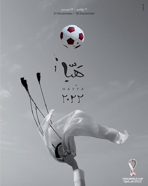
Designed by prominent Qatari artist Bouthayna Al Muftah, the poster features a hand holding up an agal – a traditional Qatari headpiece – along with dynamic Arabic typography which references cheers and calls that a crowd of fans might make.
The choice to use a black-and-white photograph is commendable here, as it injects a kind of film poster epicness into the image. It also rejuvenates the World Cup poster form, which could be said to have become tired, predictable, and too nostalgia-focused in previous years.

Qatar, 2022 – Bouthayna Al Muftah
FIFA World Cup posters: A very real art form
In the modern era, football posters have become noted more for their functionality, than for their artistic ambitions or their ability to bolster a sense of national identity.
That doesn’t mean they can’t be creative, however. You only need to look at the subtle beauty of South Africa’s 2010 poster, or the instantly iconic Japan & South Korea 2002 poster, to get a sense of the brilliance still at work in this art form.
