Film posters don't get much better
When it comes to memorable film posters, Saul Bass is a towering figure.
Noted for his striking but minimal designs, his unusual depictions of the human form, and his steadfast refusal to take the straightforward route with his artistry, he has become influential for several generations of artists.
Here, we’ll take a look at 10 of his most iconic posters:
The Man with the Golden Arm - 1955
Saul Bass gained international attention as a graphic artist for one overriding reason: his posters and artwork gave an insight into the tone and feel of a film rather than faithfully depicting a scene or a character.
He does this beautifully in The Man with the Golden Arm. In a story about a character who is battling with drug addiction (most likely heroin), the jagged, broken arm becomes an important symbol of how drugs can ravage the body. What’s also interesting here is the way it extends downwards, as if it’s reaching for something. In a film where the main character also has ambitions to be a drummer, his arm could be reaching desperately for a renewal of his musical talent.
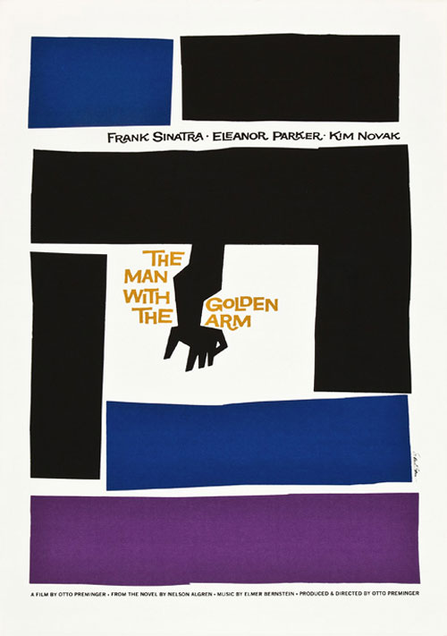
The Man with the Golden Arm
The Shining
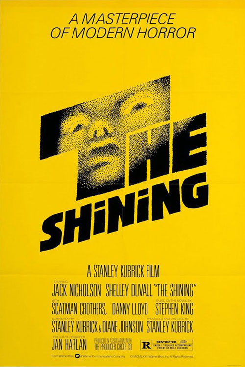
The Shining - 1980
Bass was called upon by Stanley Kubrick to work on the film poster for The Shining. Their correspondence in connection with the film’s poster design has been meticulously archived over the years, and reveals that they went through hundreds of different designs before arriving at the poster in question.
Many of the rejected designs have been collected by film lovers (you can take a look at a few of them here). Each one offers a pointillist depiction of a scene or an element from the film. There’s a drawing of the hotel maze; a drawing of Jack, Wendy, and Danny in broken silhouette; a drawing of the Overlook Hotel in starlit darkness.
In the end, Kubrick and Bass settled on the poster mentioned above, with the ghostly, recoiling child’s face lurking out of an oversized ‘T’. It went on to be used as the poster for the original US run of The Shining.
But while Bass’ poster is eerily beautiful and very in keeping with his bold, minimalist aesthetic, film studio execs believed that it said nothing about the actors in the film. To add to that, the pointillist image of the child was an artistic interpretation of the film and didn’t look anything like the child character Danny Torrance.
In the end, the studio went with a different poster for the international release – one that featured the memorable scene from the film where Jack breaks into the bathroom with an axe; a clear indication that the studio wanted to utilise their big name actor over Bass’ art.
Vertigo - 1958
As we’ve already laid out, most poster designs pre-Saul Bass simply depicted a scene or a striking visual from the film they were advertising.
Bass, however, helped widen the possibilities of this art form. He went beyond simply depicting a scene, and instead tried to depict deeper feelings, themes, and ideas found in a film.
In the ‘Vertigo’ poster, he composed fracturing swirls and striking colour contrasts, which give the viewer the feeling of vertigo even before they’ve watched a scene from the film.
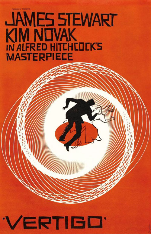
Vertigo

Such Good Friends
Such Good Friends - 1985c
Such Good Friends was a tragi-comedy which deals with infidelity in the midst of the hedonism of the 1960s, from the perspective of a woman who finds out that her husband – who is now in a coma – has had multiple affairs.
Bass brings together some of his common thematic elements for this excellent poster. There’s the entwined female legs which suggest the kind of seduction and free-spirited sexuality that was associated with the ‘Swinging Sixties’. But viewers might also note how the legs are disembodied. Bass oftened used disassembled limbs and body parts as a way of capturing the fractured, complicated nature of a film’s characters.
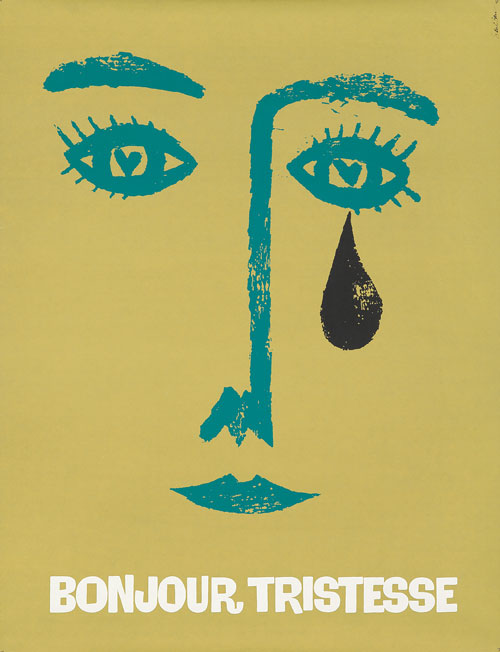
Bonjour Tristesse - 1958
Bonjour Tristesse (translation: ‘Hello Sadness’) is an adaption of Francoise Sagan’s novel of the same name, which centres around a young woman on holiday in the French Riviera with her father. It has elements of the bildungsroman, with the young woman coming to terms with her adult emotions and complexities.
As such, Bass’ depiction of the woman is very evocative even in its simplicity. In a few gentle brush strokes, a women’s face is rendered – but it is fragile, fleeting, and blank enough to suggest impressionability. Above all, the stark tear over her left eye shows how overcome she is with emotion.
With a minimal design, Bass created something which was striking and fully in keeping with the film’s themes.

Bonjour Tristesse
Love In The Afternoon
Love In The Afternoon - 1957
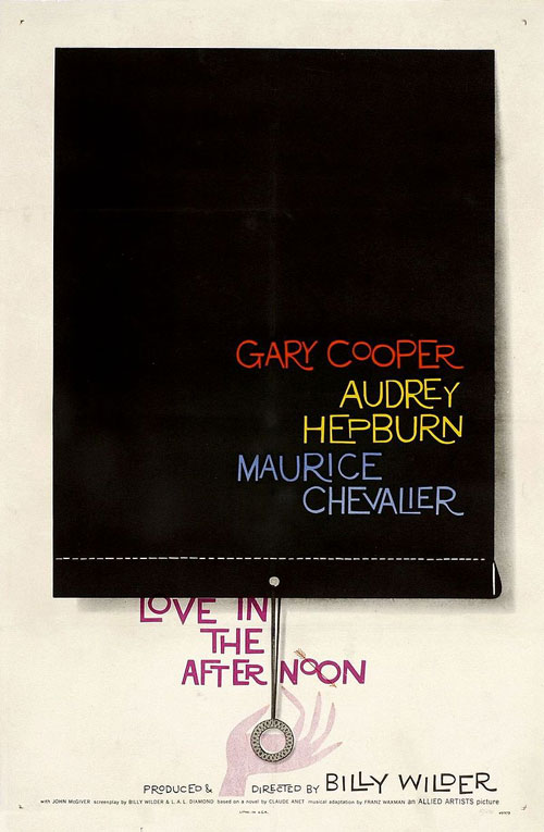
The ever-audacious Saul Bass really pulled off the impossible when he managed to get this poster approved.
In a film which contained Audrey Hepburn and Gary Cooper – two of the biggest stars of their time – Bass opted for a poster which feels shocking in what it left absent.
Bass’ poster doesn’t feature depictions of Hepburn or Cooper (both of whom were incredibly recognisable, not to mention camera-friendly), but merely includes their names.
Why? Well, Bass might have correctly understood that the names of actors might have been a selling point enough.
But more than that – he also ingeniously asks the viewer to look closer, where they’ll see that the names are printed on a black window blind which has been shut to close off a window. As is typical with Bass, there’s an enticing hint of sexuality in this poster, with the artist perhaps implying that the real ‘love’ is going on behind the blind.
Audiences might well have been rushing to their local cinemas…
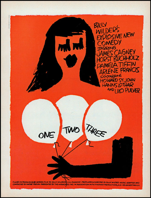
One Two Three - 1961
One Two Three is a political comedy about an American high ranking Coca-Cola executive in Berlin, who finds out that his boss’ daughter has married a communist.
The film saw Bass team up once again with director Billy Wilder, who he frequently collaborated with.
In a film that dealt with forbidden romances (communists and capitalists), Bass finds interesting ways of characterising desire in his poster. It features a minimal rendering of a woman’s head and gloved hand, holding balloons over the area where her breasts would be. In a film where balloons play a plot device, Bass features them prominently (and suggestively) in his creativity.
And, as often is the case with Bass, he subtly hints at sexuality (you might note how this film has a ‘Universal’ rating, but the ever-inventive Bass still manages to have fun with his design.)

One Two Three

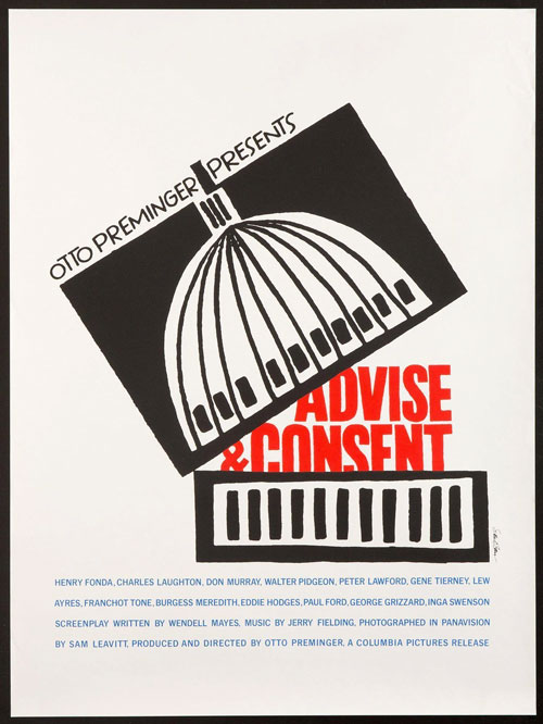
Advise and Consent
Advise and Consent - 1985c
Bass’s posters were often noted for how they could relay dense information in a starkly simple way.
For Advise and Consent – a film which focused on murky corruption in Washington D.C. – his symbolism is straightforward but striking. Here, Bass’s imagery shows a literal attempt at “lifting the lid” on The Capitol Buildng, where most of America’s murky political decisions are made.
Saint Joan - 1957
One aspect of Saul Bass’ brilliance was his ability to capture a range of different cinematic genres in his work, from romantic comedies to political dramas – and even historic epics.
In Saint Joan, which tells the epic of Joan of Arc, Bass created one of his most memorable designs. Here, we see the bottom half of a blackened figure, holding a sword which is broken in half.
In typical Bass fashion, he captures the fractured nature of Joan of Arc’s character, as well as perhaps highlighting how she was ‘broken’ by her captors and detractors. It’s set against an incredibly dynamic red background, made up of pulsating squares and featuring beautiful typography.
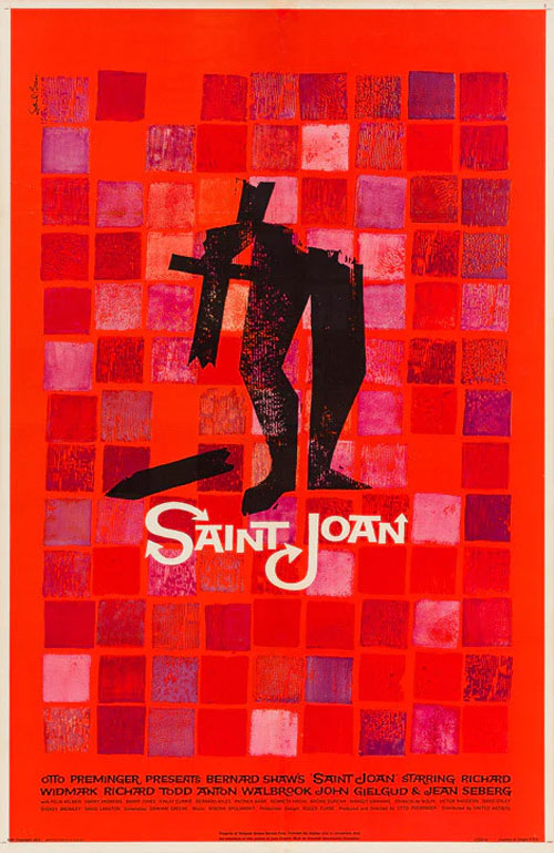
Saint Joan
Schindler’s List
Schindler's List - 1993
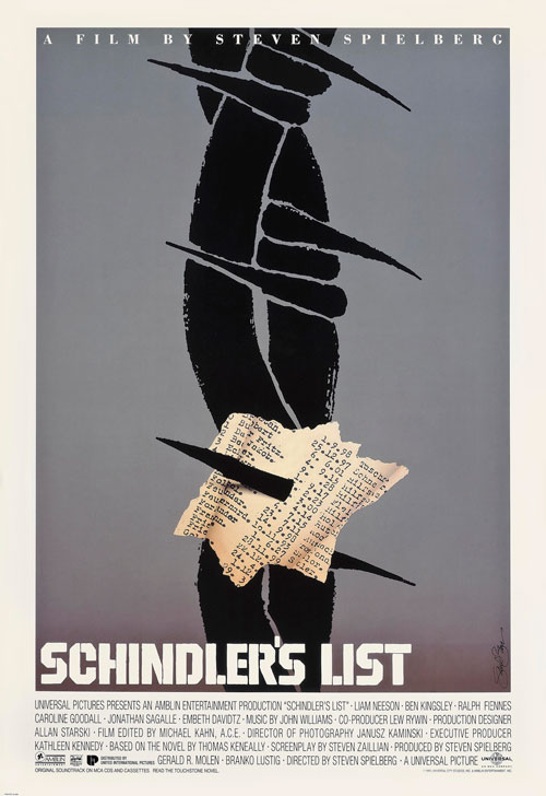
Saul Bass’ Schindler’s List poster bears all the hallmarks of his classic composition style; minimalism that favours striking, illustrated elements. In this case, we see barbed wire and criss-crossing red lines, which lock in the viewer’s eye and direct it to the pierced list of names in the centre of the poster.
Despite its brilliance, the poster was rejected for a design by artist Tom Martin, which features a photo of the film’s iconic ‘girl in the red dress’ reaching up and holding someone’s hand.
The fact that this poster was rejected perhaps reflects a change in attitude when it comes to cinema in the 1990s. Studios were once again aiming for poster designs which depicted scenes or characters from the films themselves, while the subtler symbolism and artistry of designers like Saul Bass was unfortunately considered less essential.
Saul Bass’ posters heightened the films they were designed to promote
It’s hard to imagine now, but there was a time where the promotional campaigns surrounding a film’s release were mainly considered from a business point of view and barely warranted any artistic input.
But with Saul Bass, promotional posters became an integral part of the event surrounding a film release. With his forwardthinking ideas, film posters could help set the scene and tone for a film, help entice an audience, and – ultimately – help heighten the entire filmgoing experience.
As a poster designer, his legacy is unparalleled in 20th Century cinema.
