Art Deco Posters - Unique and Modernist
Despite coming to prominence between the First World War and the Second, it could be argued that Art Deco had surprisingly little to say about war. Art Deco Posters were not the exception.
In fact, the artists of this era were much more concerned with construction, rather than destruction.
Their style – unique and modernist – was fascinated with new ideas in architecture, machinery, and effective usage of space.
This was true of poster design as much as anything else.
With that in mind, here are 10 Art Deco posters which give an insight into the Art Deco style:
Dubonnet Wine Poster - A.M. Cassandre 1932
One of a series of posters designed to promote the French aperitif, A.M. Cassandre’s Dubonnet posters are considered to be some of the painter’s most renowned works.
The figure in the poster cuts a sharp, striking shape. He appears in silhouette against a bright mustard glow behind him, which hints at a warmly lit bar.
Its bold use of colours and uncluttered design were very much in keeping with the Art Deco style – these artists favoured ideas that were as eye-catching as they were original.
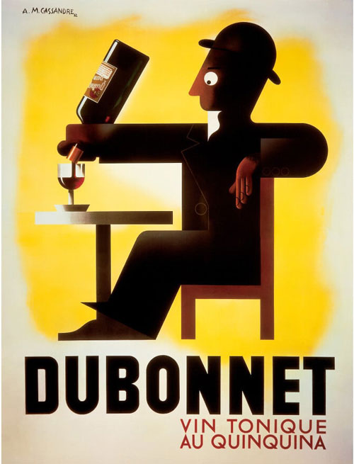
Dubonnet Wine Poster – A.M. Cassandre
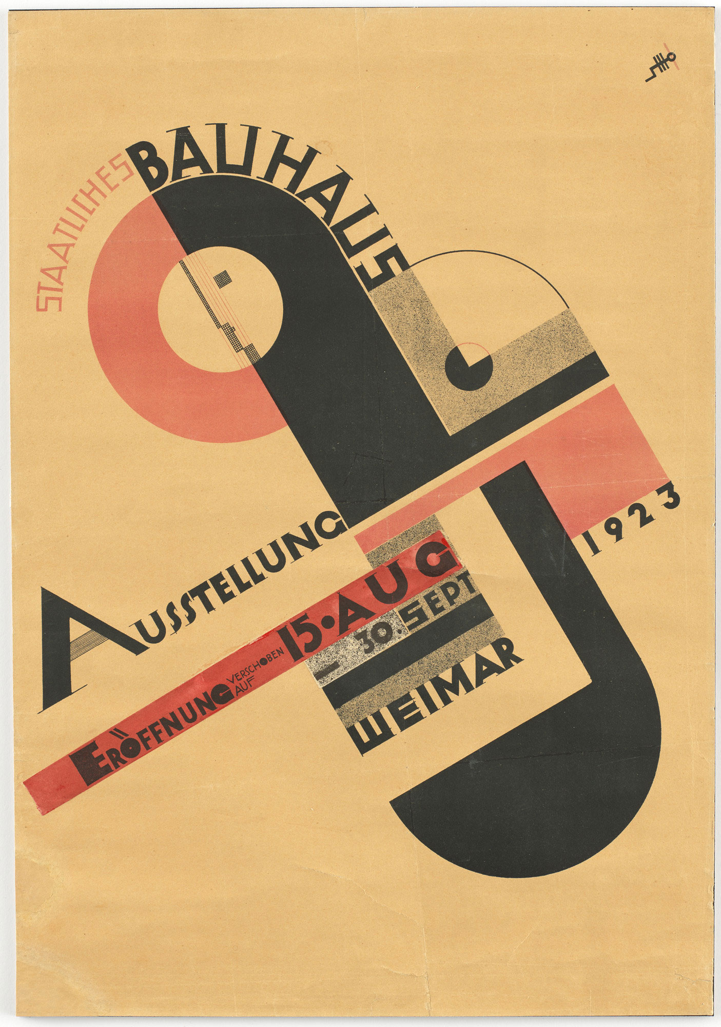
Bauhaus Exhibition in Weimar – Joost Schmidt
Bauhaus Exhibition in Weimar - Joost Schmidt 1923
Considered one of the most influential artists of his era, Joost Schmidt was a teacher at the Bauhaus, a school in Weimar Germany which sought to challenge and elevate public perceptions of art and design.
Schmidt created this poster for a competition and saw it exhibited at the Bauhaus Exhibition in 1923.
It was daring in its geometric design. It also gives an insight into the ideas that Art Deco artists were having. Look at how Schmidt moulds these boldly-coloured shapes to look like cogs in a machine or an architectural blueprint. In Schmidt’s work, an exhibition poster can be more involved than simply laying out dates or locations.
Schmidt, along with others from the school, had a profound influence on the world of architecture.
Cycles Dilecta - G. Favre 1928
By the late 1920s, Cycles Dilecta had become one of the biggest premium cycling brands in France, at a time when the activity was growing rapidly in its popularity.
This design, as with other Art Deco designs, sought to stress newness and modernity. With his geometric shapes, artist Favre depicts a bicycle that is sleek, light, and lightning fast. On top of that, it’s worth pointing out how Favre’s design imitates Cycles Dilecta’s original logo, which had a letter ‘A’ overlaying the letter ‘C’.
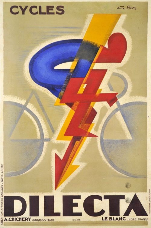
Cycles Dilecta – G. Favre
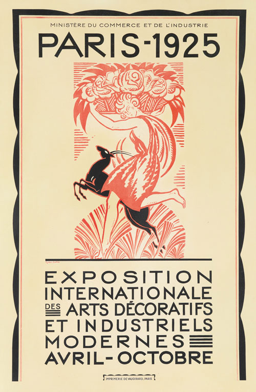
Paris – Robert Bonfils
Paris - Robert Bonfils 1925
This fascinating poster was used to introduce the 1925 International Paris Fair.
Bonfil’s poster is beautiful for many reasons. Look at how he creates a rich image using almost exclusively one colour, with a really beautiful, dynamic scene of a woman leaping alongside a stag. Look at his authoritative bordering. Look at how the typography suggests importance.
According to the MIA Art Collection, the six-month International Paris Fair actually helped popularise the term ‘Art Deco,’ with many of the artworks at this exhibition reflecting the careful ornamentation, machine-like designs, and sleek modernity that came to define this era.
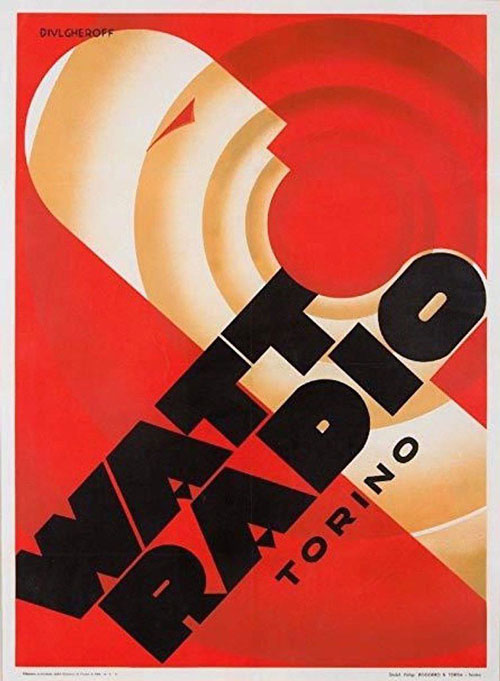
Watt Radio - Nicolay Diulgheroff 1933
Advertising a brand of radio, Diulgheroff’s incredible work really speaks for itself. With his bright colours, sonic-esque concentric circles, and the open mouth of the man depicted in the poster, this image really does scream – much like a loudly blared radio.
Art historians have called this image “nothing short of a visual fire alarm,” and you’d be hard pushed to disagree.

Watt Radio – Nicolay Diulgheroff
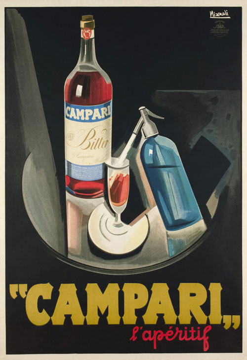
Campari – Marcello Nizzoli
Campari - Marcello Nizzoli 1926
Campari is one of the most recognisable liquors in the world, and its iconic brand label was carefully devised by various designers and artists, all of whom tried to perfect its classy appeal.
In this poster, created by Italian illustrator Marcello Nizzoli, the Art Deco style is used to give a real sense of atmosphere. The image is modernist, with its straightforward lines and curves, but the detail of the bright red Campari bottle makes it stand out, almost giving us a taste of it.
Pivolo Aperitif Aux Vins De France - A.M. Cassandre 1924
The story goes that A.M. Cassandre took the phonetic sound of ‘Pivolo’ – ‘pie vole haute’, meaning “magpie fly high” in his native French – and, from that, conjured up the image of the magpie for this brand.
This is a curiously brilliant poster, which incorporates elements of the Avant-Garde in the typography of ‘Pivolo’. But the simplicity, symmetries, and the straightforwardly pleasing image of the bird open-mouthed in delight, all make this a textbook Art Deco poster.
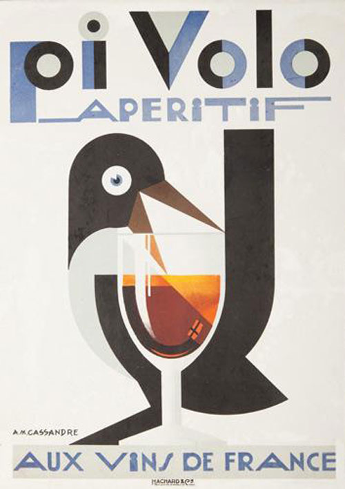
Pivolo Aperitif Aux Vins De France – A.M. Cassandre

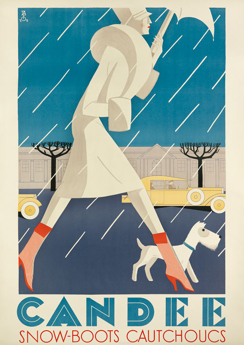
Candee – Franco Barberis
Candee - Franco Barberis 1929
Used to advertise Candee all-weather snow boats, this image is a perfect example of how effective Art Deco could be in terms of suggesting elegance. The sharp, symmetrical lines of the woman’s dress are in keeping with 1920s ideas of women’s fashion, while the clear lines of the building in the backdrop are in keeping with the contemporary ideas of architecture.
The implication here? Not only are these boots perfect for any weather, they’re also the height of stylishness too.
Aquarium de Monaco - Jean Carlu 1926
Born to a family of architects, Jean Carlu turned his attention to graphic design after losing his arm at the age of 18. He went on to become one of the most inventive designers of the Art Deco age, discovering a flair for constantly reinventing the form in surprising ways.
The spatial dimensions of the Aquarium de Monaco are really incredible. Carlu superimposed the image of an eel over the image of a sunfish, over the image of a scorpion fish. This results in an image that somehow appears both flattened and textured. If the aim was to introduce viewers to the wonders of an aquarium, Carlu fully understood the assignment…
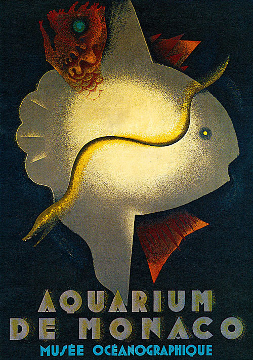
Aquarium de Monaco – Jean Carlu

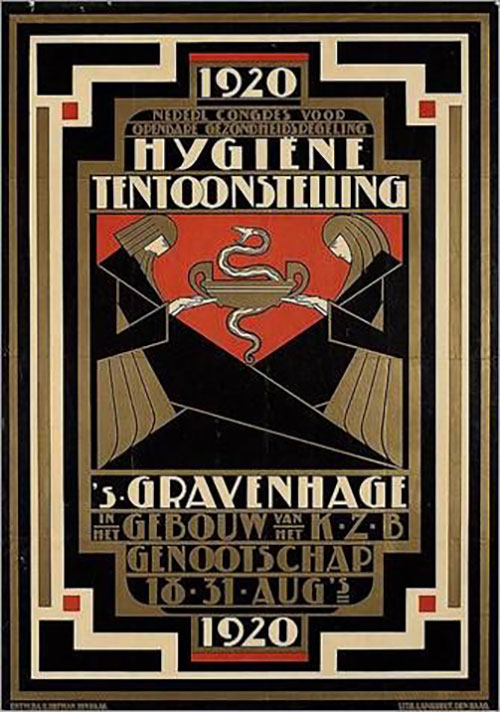
Hygiene Tentoonstelling – Pieter Hofman
Hygiene Tentoonstelling - Pieter Hofman 1920
Designer Pietar Hofman created this poster for a Hygiene Exhibition in the Netherlands in 1920 (‘tentoonstelling’ literally translates as ‘hygiene’).
The poster utilises the kind of ornate, straight-edged borders that were popular in Art Deco art (anyone who has seen Baz Luhrman’s The Great Gatsby will already be aware of how it has strong associations with a particular era). These borders not only suggested class, but they linked their subject matter with the Art Deco architectural styles of the time.
In terms of the added context, the staff with a twisted snake and winged beings holding it aloft has long been associated with the medical profession. Here, Hofman gives them an effective modernist spin.
Art Deco found beauty in modernity
One of the legacies of Art Deco artists is how they managed to find beauty in the modern world where others hadn’t thought to look for it. Machines, fixed lines, functional architecture – all of it could be aesthetically pleasing if given the right stylistic attentiveness.
This was to have an impact on the way artists, designers, and architects reacted to the major upheavals of the 20th Century. The answer to new machinery, new technology, and new ideas wasn’t to be fearful – it was to get excited.
Even today, artists are still learning that lesson.
