Just a poster? Take a closer look
There are only a few films in history which arrive on our screens perfectly crafted, stupefy audiences and critics alike, and then make off with every award under the sun while everyone’s still trying to process what they’ve just witnessed.
The Silence of the Lambs is one such film.
Released in 1991, this adaption of Robert Harris’ novel was directed by Jonathan Demme and featured career-defining performances from leading cast members Jodie Foster and Anthony Hopkins. It went on to become the first horror film to win the Oscar for Best Picture, as well as bagging dozens of other accolades.
The film completely transformed the psychological crime thriller genre. It did this by offering us a storyline that kept us guessing – a storyline which invited us to find answers to its gruesome mysteries if we could only hold our noses and look more closely at what was hidden in plain sight.
Naturally, for a film as perfect as this, it had a poster which reflected that idea of gruesome or darker mysteries being hidden in plain sight.
What’s happening in the poster for The Silence of the Lambs?
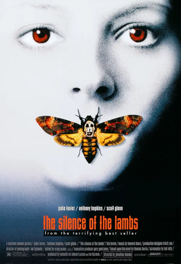
Created by the ad agency Dazu, and in particular by artist Dawn Bailie, the poster depicts a close-up headshot of Clarice Starling, the film’s main character. In the poster, her face is completely white, apart from the left side of her head which is in shadow.
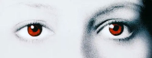
Her eyes are an unnatural red tint as she’s staring out from the poster at you.
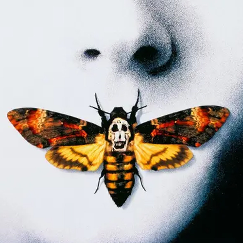
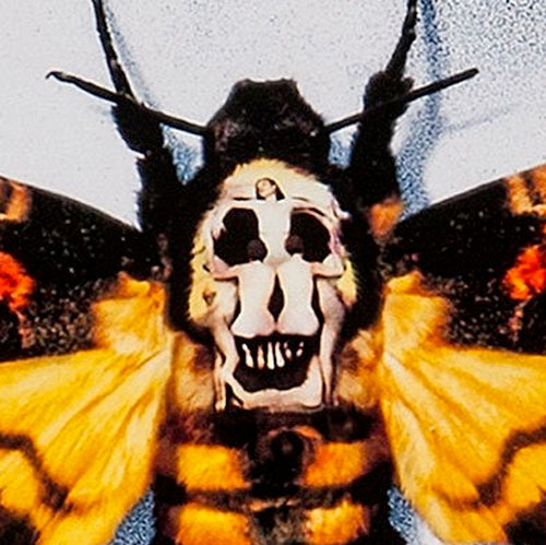
Over her mouth sits a moth which has black and gold colours on its wings and body. The back of the moth’s head appears to look like a human skull. However, on closer inspection (if you’re looking at the image on a laptop or phone, you might really need to zoom in), you see that it is actually seven naked human bodies positioned to look like a skull from far away.
So what is going on here?
A lot, as you might’ve guessed. The Silence of the Lambs poster is steeped in symbolism and has many hints about what the film might contain.
Let’s look at them in parts:
The face of death
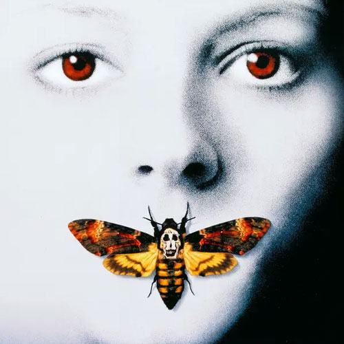
Slap bang in the centre of the poster is Clarice’s face. Right away, you’ve got your bankable, recognisable film star in there (Jodie Foster had won an Academy Award just three years earlier and was at the height of her game). But unlike how she appears in the film, Clarice’s skin is pure white here and her facial expression is one of vulnerability. This might suggest her innocence or her weak stomach in the face of the gruesome crime she’s investigating (she’s a rookie, after all, and struggles to decode Hannibal Lecter’s riddles). It also makes you think of death, as Clarice looks like she might be a cadaver on a pathologist’s table here.
The eyes of a killer
Penetratingly red. Inhumanly red. Making them this colour might be a reference to a quote from the novel, where Harris writes that Hannibal Lecter’s eyes are “maroon” and are like “pinpoints of red.” Is there a suggestion here already that Clarice may have to think like a killer – may, in fact, have to embody some aspects of Hannibal Lecter – in order to catch Buffalo Bill?
Deaths Head Hawkmoth
The moth is the same moth which Buffalo Bill lodges in the throat of one of his victims, while the fact that it’s on Clarice’s lips is an obvious reference to ‘silence’. But there’s more going on here. The moth in question is a death’s head hawkmoth – a particular breed which has evolved to have a skull-like feature on the back of its head and which was traditionally seen as an omen of death. Death, evolution, transformation – the death’s head moth becomes the ideal symbol for what the psychotic Buffalo Bill is doing with regard to his killings. But that’s not all…
Surrealist details
Not content with just having the moth’s skull as a symbol, Baillie adds an extra, important detail to the poster. The image of the skull is actually made up of seven bodies, painted and positioned to look like something else from a certain perspective. It is taken directly from the ‘Women Forming a Skull’ piece by surrealist Catalonian artist Salvador Dalí (Dalí himself was extremely interested in perception).
The Typography
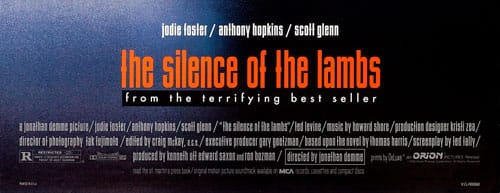
The title of the film is in red and is written using an OPTI BinderStyle, which artist Dawn Bailie has said was a favourite of hers. The leading actors are listed above the title, while the words “From the terrifying bestseller” are written below. More than anything, this poster has the good sense not to give away more than is necessary with the text. Think of how much worse this poster would be with some cheesy tagline attached to it. When you’re steeping your film poster in the kind of symbolism and hidden imagery as listed above – and when you have big names like Jodie Foster and Anthony Hopkins on the bill – why cheapen things with a few inane words? To paraphrase Shakespeare, “brevity is the soul of great film poster design.”
So what do we have then? In a single image, we have everything that makes The Silence of the Lambs so compelling.
We have the tension between Clarice’s ‘good’ morality and her potential ability to think like a killer; we have the tension between not knowing whether the character we’re seeing is dead or alive; we have the blurring of the lines between human bodies and animalistic shapes; and we have overtures of central themes in the film like evolution, metamorphosis and transformation. And we have it all without overegging things or giving too much away.
Not bad for something that’s going onto billboards and magazine pages, right?
A film poster that left an award-winning legacy
In 2006, at the Key Art Awards, the original poster for The Silence of the Lambs was named best film poster “of the past 35 years.”
The influence of the poster showed that you didn’t have to sacrifice dense symbolism in order to promote a popular film – you could have it both ways if you had the right artist at the helm.
Even to this day, you’ll hear of people talking about how long it took them to realise that the moth in the poster contains a skull, then how it took even longer to realise that the skull is actually made up of contorted human bodies.
As audiences continue to enjoy the macabre mysteries that The Silence of the Lambs has to offer, so too are they continuing to enjoy this iconic poster.
