The best way to see London
One unique quirk from the UK’s art history is the fact that the organisations which make up London Transport became one of the greatest patrons of British poster art throughout the 20th Century.
This was no accident. In fact, historian David Bownes wrote a whole book on this matter with his 2011 publication London Transport Posters: A Century of Art and Design. In it, he documents how London Transport administrator Frank Pick took an active interest in the aesthetics of the capital city’s transport system.
Pick – and those who followed him – believed that the London Underground, London buses, and other modes of transport in the city, need not just be functional, but also exciting centres for original artistic designs.
As this article will show, London Transport employed some of the most exceptional artists of their 20th/21st Century to create posters that both advertise the benefits of using London Transport, as well as generally reflect on London as a pleasing, compelling, exhilarating behemoth of a city.
Here are 11 posters which give an insight into the history of London Transport.
Central London Tube Railway - Unknown 1905
In 1900, just as a new century was dawning, the Central London Railway was opened and linked much of London’s central area with one single tube.
As London grew, and rail travel became more popular, this poster was published to highlight the comfort, affordability, and excitement that comes with travelling by rail. The people depicted in the image give a sense of how the artist wanted to make rail seem like a sophisticated option.
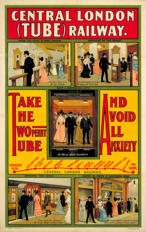
Central London Tube Railway – Unknown

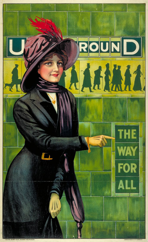
Underground – the way for all – Alfred France
Underground - the way for all - Alfred France 1911
One important element of early underground rail travel was that it was promoted as being fully egalitarian. The working class could rub shoulders with the bourgeoisie and vice versa. The labourer could travel in the same direction as the socialite.
Alfred France makes this clear in his 1911 poster. Look at the silhouettes of the people within the tiled walls in the background of this poster – they’re clearly from all walks of life.
The day will come when the Joybells will ring again - Anna Katrina Zinkeisen 1944
Surely one of the most emotive titles for a poster ever, Anna Katrina Zinkeisen’s ‘The day will come when the Joybells will ring again’ transposes a Second World War propaganda poster into a transport poster, taking the words from a Winston Churchill speech for its message. The poster was commissioned to thank the tireless resolve of Transport staff and patrons, as the War was entering its final phases.
It’s a relatively standard propaganda poster – note the well-trodden motifs of the graceful blonde, the hypermasculine man, and the pastoral setting – but it’s emotive nonetheless.

The day will come when the Joybells will ring again – Anna Katrina Zinkeisen
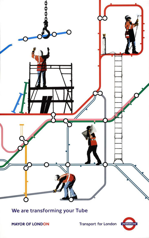
We are transforming your tube – Studio Oscar
We are transforming your tube - Studio Oscar 2007
Again, a poster which reflects a very specific time and place.
The London of 2007 was an integral part of New Labour Britain, Tony Blair Britain, globally-facing Britain – where the 8 million-strong capital city was the country’s economic backbone, and buzzwords like “transformation” were a major part of the political lexicon (much more effective than, say, “building work” or “touch-ups on the Underground”).
Studio Oscar distils all of this into a brilliantly straightforward – but incredibly smart – design. What’s so great about this poster is that everyone in London would understand the visual language of the white dots and the crisscrossing coloured lines. The designer team at Studio Oscar take that language and use it as the basis for a humorous visual joke.
The Lure of the Underground - Alfred Leete 1927
With a surrealist, humorous, cartoon-esque style, Alfred Leete captures the irresistible lure of the Underground, with everyday citizens literally floating towards a tube tunnel.
Who cares if it’s hyperbolic? It’s wrily beautiful and was no doubt very memorable and effective.
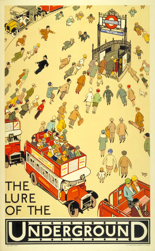
The Lure of the Underground – Alfred Leete
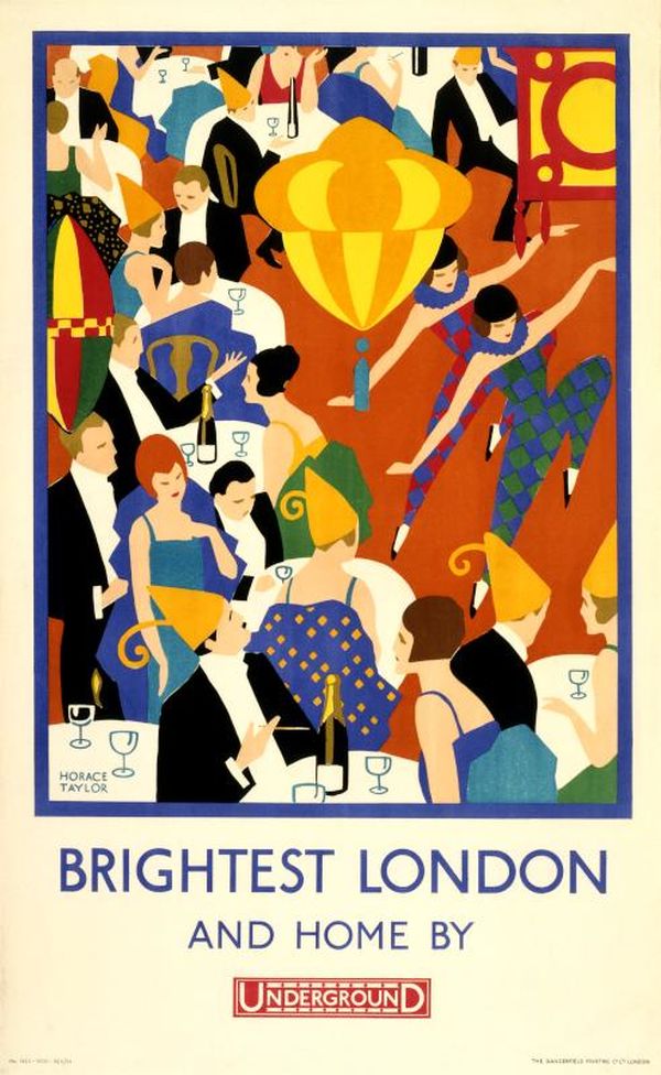
Brightest London and home by Underground – Horace Taylor
Brightest London and home by Underground - Horace Taylor 1924
Let’s stress again the fact that London Transport made a point of supporting artists who were trying to be innovative and original in their work.
Horace Taylor’s 1924 poster isn’t just notable for its beautiful colours and lively depiction of the Underground, but also because it’s a clear example of the still-new Art Deco artistic style. The poster is captivating, joyous, and artistically relevant. All in all, a PR coup for London Transport.
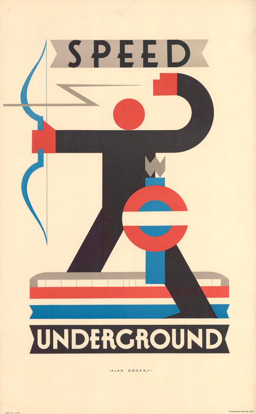
Speed Underground - Alan Rogers 1930
The bar and circle roundel had already become the signature logo for the London Underground decades before Rogers’ 1930 design, but his poster shows how this instantly recognisable symbol could be padded into original designs.
Here, Rogers verges on the avant-garde with his sharp geometric shapes.

Speed Underground – Alan Rogers

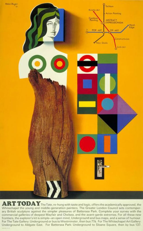
Art today – Hans Unger
Art today - Hans Unger 1966
As you might already have guessed, the 1966 ‘Art Today’ poster was commissioned to promote the various contemporary art galleries and museums which were taking off in London during the 1960s. German graphic artist Hans Unger does a fine job of creating an eye-catching pastiche of contemporary art movements.
The map in the top right corner of the poster features destinations which are actually modern art styles. If you look closely, you’ll see ‘Kinetic Art’, ‘Constructivism’, and ‘Neo-Dada’ on there.
London Transport Collection - Tom Eckersley 1975
English artist Tom Eckersley perfected a refined graphic design style that is very much revered even in the present day. He was noted for how he used simple, flat geometric forms to arrive at an evocative yet minimal image.
Here, he advertises the London Transport Collection by depicting the basic shape of a steam engine. It’s marvellously effective.
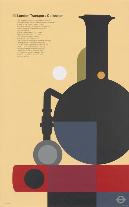
London Transport Collection – Tom Eckersley
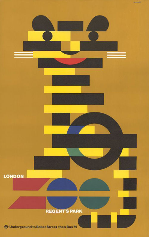
London Zoo – Abram Games
London Zoo - Abram Games 1976
Yet another example of London Transport giving full reign to their commissioned designers and letting them follow their own sense of artistic expression.
Games’ poster is a beautiful thing. With just a few concrete, rectangular blocks of colour, he somehow conjures up an adorable depiction of a zoo animal. He even manages to get the London Underground roundel in there. Pitch perfect.
Keep your personal stereo personal! - Tim Demuth 1987
A humorous poster which very much reflects the time in which it was made. Tim Demuth’s poster was commissioned as a gentle reminder to cassette player users to keep the volume down when listening to their music.
Everything about this poster, from the jagged lightning lines, to the cassette tape, to the old school headphones, to the mannequin head, somewhere screams “1980s.”
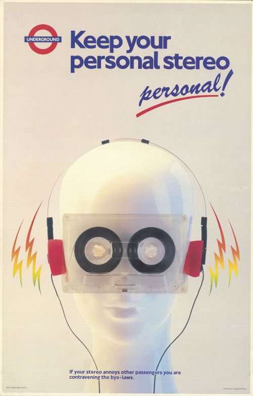
Keep your personal stereo personal! – Tim Demuth
Selling London Transport to the masses
Tourists to London will often count the London Underground as a must-see tourist experience in and of itself.
As bizarre as it might seem to other major cities, London’s transport system has built up an almost mythic status (even though, in real life, it can be incredibly cold and chaotic).
Much of this mythic status comes down to the decades of innovative poster art which genuinely helped sell the idea of London transport to the public.
With that, dozens of poster artists earned a unique place in art history.
