What is lithography?
Lithography is a printmaking technique which, put simply, came about due to the fact that oil and water don’t mix.
Lithography uses this chemical fact as the basis for making physical graphic designs which are easily reproduced.
To produce these design pieces, artists worked with greasy crayons or liquid on polished slabs of limestone or, in modern times, aluminium plates, which are then treated with a chemical mixture that allows it to bond to the stone/metal. After a process which adds water to the mix, paper can be placed on top of the stone/metal and the design on the stone will be transferred over. In this way, the image is set, but can be reproduced many times.
Today, other types of lithography such as offset lithography, photolithography, and transfer lithography commonly used.
Why is lithography important for poster making?
Having gained renewed popularity among artists in the 1890s, lithography was used extensively by poster designers throughout the 20th Century.
Lithography offered designers new opportunities. In particular, designers enjoyed being able to draw freely and artistically on the stone, while the medium also offered them commercial opportunities due to the fact that they were able to create high-quality lithograph posters at a high volume.
What lithograph posters help explain developments in lithography?
Here are five posters which will give you an insight into lithography and its importance for poster design:
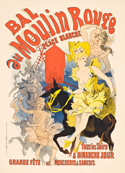
Moulin Rouge - Jules Cheret 1890
Jules Chéret is considered by man to be the “father of modern posters”.
He earned that title for a number of reasons.
Firstly, Chéret was an artist who truly understood the benefit of combining the art world with the advertising world, and he embraced the fact that artists had new opportunities to market themselves to big commercial organisations.
Secondly, Chéret was working during the height of the Art Nouveau period, when poster art was at its zenith and was considered to be a fully-fledged movement – capturing the craziness, social dynamism, and blossoming commercial power of European cities like Paris and Brussels.
And thirdly, Chéret was one of the main designers who helped renew an artistic interest in lithography. Despite the fact that the medium had been unpopular throughout the 19th Century, Chéret was quick to understand the benefits of colour and monotone lithography, and many of his peers and students began using lithography too, following his lead.

Moulin Rouge – Jules Cheret
Cycles Perfecta – Alphonse Mucha
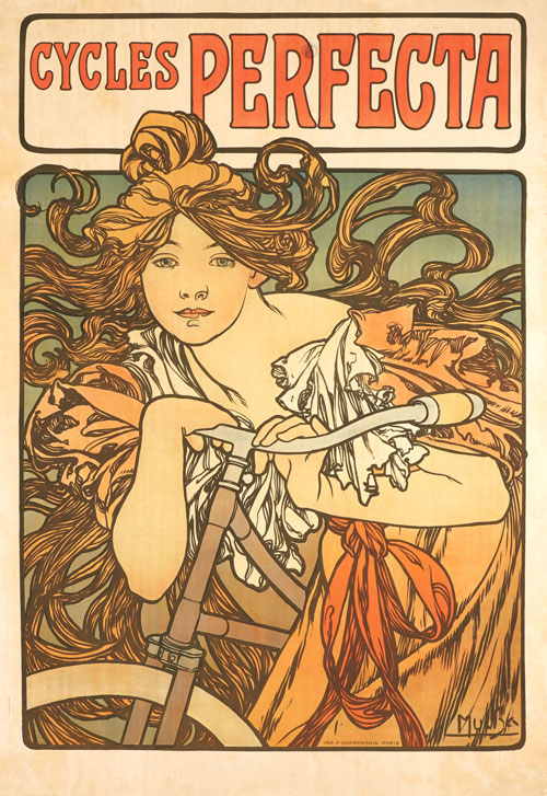
Cycles Perfecta - Alphonse Mucha 1902
Let’s go back to that idea of the freedom that was afforded to artists who worked with lithography as a medium.
As artists began to better understand the technology and processes that were involved in lithography, they became more emboldened and creatively freed up in terms of their designs.
By the turn of the century, artists like Mucha knew that all their vivid colours, intricate designs, and bold ideas could be rendered accurately, on a mass scale, via lithographic techniques.
So this is why we started seeing artists opt for these beautiful, ornate designs – like the Cycles Perfecta – and why they became more common. Lithography meant that you didn’t have to be economical about your colours or your designs, even if they were intended for mass media.
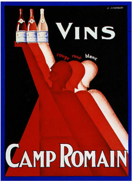
Vins Camp Romain - Gadoud Claude 1930
One of the downsides of the digital age is that it can be difficult to get across, via an online image, how well lithographic art pieces and posters worked as physical objects.
Lithography was prized in the early 20th Century because of its ability to offer vivid colour contrasts in an image – which was necessary for those eye-grabbing lithograph posters that both artists and advertisers desired…
A good example is this striking art deco poster, which was created by Gadoud Claude and used to advertise Vins Camp Romain (translated directly as ‘Camp Romain Wine’).
The image here shows three Roman soldiers depicted in a sleek, modern style, each holding a bottle of red, rose, and white wine.
As you might expect for a poster which is advertising wine, colour is everything. Look at how Claude manages to capture the richness of each of the three different wine colours in his image. You can practically taste the robustness of the red, the fruity balance of the rose, and the crispness of the white…

Vins Camp Romain – Gadoud Claude
Attack of the 50-Foot Woman – Reynold Brown
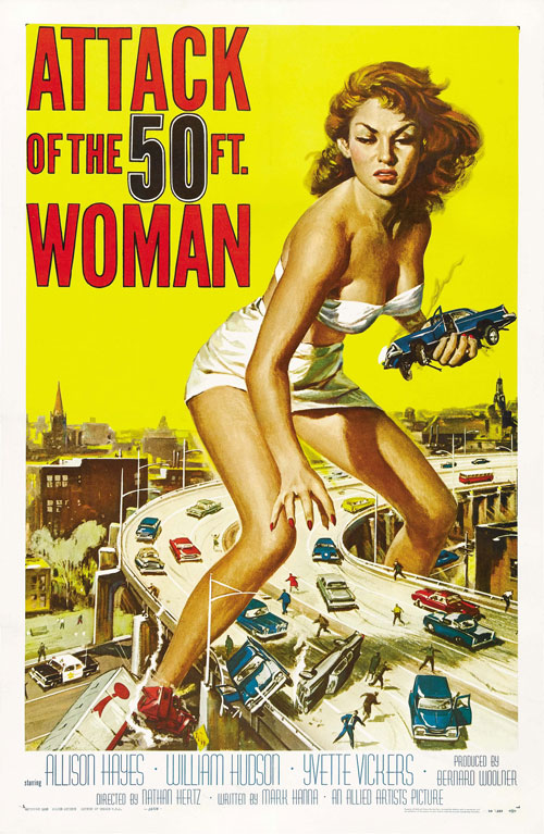
Attack of the 50-Foot Woman - Reynold Brown 1958
As lithography gave rise to new opportunities in terms of artistic freedom and bold use of colour, it also allowed designers to more vividly depict important marketing methods, namely – sex and desire.
With Attack of the 50 Foot Woman, artist Reynold Brown was clearly looking back to the sensuality, sexuality and liberation of women as depicted in classic Art Nouveau lithograph posters, even as he depicts the mammoth, monstrous presence of the giantess Nancy Archer (played by Allison Hayes).
The result was that he produced one of the most coveted and sought-after posters of its time – and one that set a precedent for the 1950s sci-fi genre.
The poster is included on Premiere Magazine’s list of “25 Best Movie Posters Ever.”
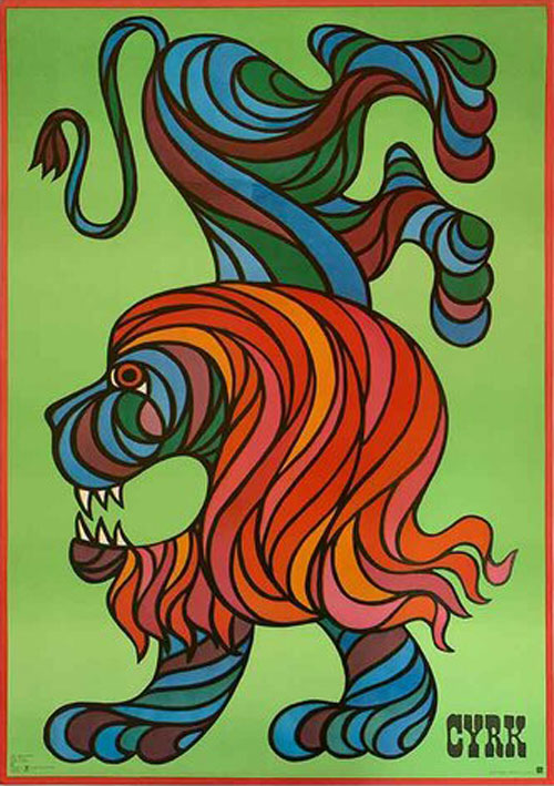
Cyrk - Hubert Hilscher 1970
When looking at lithography and lithograph poster design in the 20th Century, it’s always important to take note of specific historical contexts.
The end of WWII and the beginning of Soviet-backed Communism in Poland marked a significant period for Polish poster art, with a group of leading artists and their work being grouped under the banner of ‘Polish School of Posters’.
Art historians have documented how the Communist regime commissioned artists to develop posters which contained not just social and political messages, but cultural messages too.
In amongst this, posters were commissioned that reflected society’s interest in the circus (or ‘cyrk’ in Polish).
Cyrk posters began appearing in the early 1960s, with state authorities commissioning artists to develop a new, more modern – and more abstract – approach to circus posters. These posters were not intended to be the baroque, vaudeville, visually obvious posters of the past, but they were meant to be artistic, original, and humorous. This comes through very clearly in the brilliantly evocative use of imagery in Hilscher’s ‘Cyrk’ posters.
So what does this have to do with lithography?
Well, it all comes back to historical context. With lithography, mass-produced, artistically innovative posters – created by first-rate designers like Hilscher – could be plastered up on every part of Poland’s visual infrastructure that could be said to be revealing ‘cracks’.
In particular, these posters went up around building sites that were being worked on, as well as industrial locations and streets that needed a bit of colour. All of a sudden, dreary landscapes were injected with the type of vividness and artistic richness that lithography afforded.

Cyrk – Hubert Hilscher
The lasting legacy of lithography
Much has been made about the various poster artists and designers who propelled major developments in both the art world and the commercial world over the last 100+ years.
But in a very real way, lithography helped facilitate these major developments. Without it, the very idea of the modern poster would likely not exist. And while the process involved in making lithograph posters may have changed significantly in the last 100 years, learning about this medium can tell us a lot about the modern landscape of art.
