Designs without definition
Despite its prevalence in the recent history of poster art, the term ‘post-modern design’ has a rather loose definition.
The style emerged just as the influence of the ‘International Style’ began to peter out. While the International Style was considered formal, the ‘post-modern’ style allowed for free association, pastiche-esque designs, and complexity for the enjoyment of complexity.
As well as this, the post-modern design style of the 1980s didn’t have a distinctive nucleus or localised hub (in the way that the International Style felt grounded in Switzerland with the Swiss artists who perfected it).
As modern technology was evolving, and as the digital era was on the cusp of becoming omnipresent, artists were much more at home with drawing inspiration on an international level. As this article will show, graphic designers from both sides of the Atlantic Ocean were employing the post-modern style within their work, for a variety of different purposes and varying results.
So while there’s no set definition for ‘post-modern design’, this article will aim to note the similarities of 9 famous posters from the era:
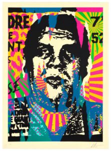
Art Scene Zurich - Paul Bruhwiler 1981
Designed for an Art Festival in Zurich during the winter of 1981/82, Bruhwiler’s poster is a good example of the post-modernist style in action.
There’s a seemingly freewheeling use of colour in this poster, with reds, purples, and yellows bleeding into the typography.
In the centre of the poster, a person’s eyes stare out from what appears to be a TV – all of it rendered in black and white pointillist dots. Even here, cuts of random colour seem to peel through the pointillist design.
The poster is evocative, maximalist, and influenced by numerous designs – but without sticking to the strictures of one particular form.

Art Scene Zurich – Paul Bruhwiler

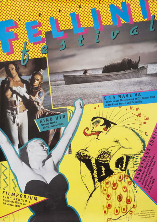
Fellini Festival – Stefan Meichtry
Fellini Festival – Stefan Meichtry
In a modern, mass-media era, post-modernist designers clearly made a point of maxing out the imagery on their posters.
This might explain the odd beauty, chaos, and utility of Meichtry’s Fellini Festival poster. The pointillism, the cut outs, the squiggles, the colours, the mish-mash of iconic scenes cut from La Dolce Vida, E La Nave Va and Ocho Y Medio; all of it geared towards one purpose – demanding your attention.
And, it’s important to stress that under the umbrella of ‘post-modernism’, neither subtly nor unsubtly really mattered when it came to art. Everything was permissible – as long as it was new and emotive.
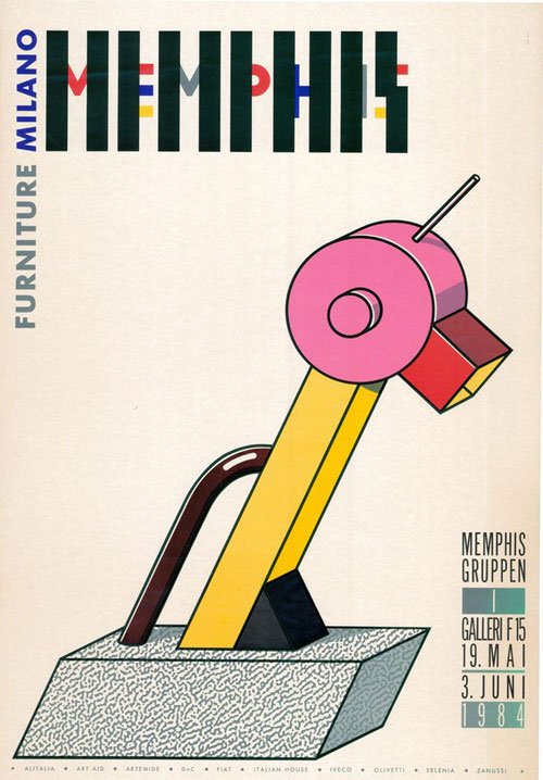
Furniture Milano – Mamphis Gruppen 1984
The Memphis’ Group’s design work has been loved and loathed by art critics, architectures, and designers, ever since it first began to make an impact in the early 1980s. One writer criticised there work by calling it “a shotgun wedding between Bauhaus and Fisher-Price,” which, in our opinion, is something of a badge of honour…
The Memphis Group were inspired by Art Deco, Pop Art, and elements of Avant-Garde, but they were intent on taking these ideas right into the components of what makes a domestic space. Chairs, table lamps, settes, and desks became both functional, colourful, and – most importantly – uncanny (which is perhaps why so many people weren’t comfortable with their work).

Furniture Milano – Mamphis Gruppen
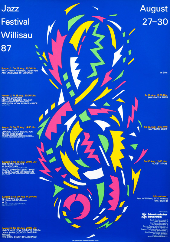
Jazz Festival Willisau ’87 – Niklaus Troxler
Jazz Festival Willisau '87 - Niklaus Troxler 1987
Niklaus Troxler designed some truly eclectic jazz posters over the course of his career, with his ‘Jazz Festival Willisau’ actually being one of his more tame ones.
But what’s really beautiful about this image is how Troxler uses just a few snippets of colour in order to create a treble cleft which is bursting with kinetic energy. If jazz is a difficult genre to define, then it follows that post-modernism might just be the perfect visual art form to depict it…
Kunst - Kredit 81/82 - Wolfgang Weingart 1981
A common theme for many post-modernist designers was the emphasis on distortion as an artistic technique (as we’ve seen already in the works of Meichtry and Bruhwiler). Here again, with Weingart’s image, distortion is employed to great effect.
We note the fuzziness of the background, the way the yellow frame seems to dissolve into the edges, and lack of context for the smattering of dark clouds in the centre of the image.
In the chaos, the text takes centre stage. We’re not really sure where to look, so our eyes are drawn to the clear, unmistakeable sans serif typeface. Here, we get all the information we need!
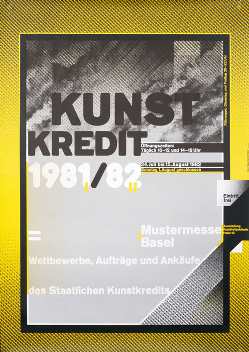
Kunst – Kredit 81/82 – Wolfgang Weingart

Neue Deutsche Filme – Filmpodium Zurich – Paul Bruhwiler
Neue Deutsche Filme - Filmpodium Zurich- Paul Bruhwiler 1981
Ever the innovator, Paul Bruhwiler makes interesting use of a minimal palate of colours in this poster for a New German Film event.
The colours are from the German flag, and the person depicted looks like a futuristic member of Kraftwerk, while the geometric lines hint at Art Deco influences. It’s hard to be sure what the person is spewing from their mouth in this image, but the provocativeness of it certainly chimes with the post-modernist idea of making things which are original and ‘neue’.
Le Parfum – Razzia 1984
As with Bruhwiler and several other artists mentioned here, we witness how art deco becomes post-art deco in 1980s post-modernist design. The French graphic artist opts for minimalism, brilliantly executed colouring, and fascinating geometric lines in his depiction of a sophisticated woman.
Razzia may well have been ahead of his time when it came to setting a tone of sophistication for a perfume advertisement rather than explicitly refering to the product itself (we’ve all seen how bizarre perfume commercials have gotten in the 21st Century).
If you can’t translate a smell in an image, then why not use sensual imagery to simply evoke feels of happiness, richness and satisfaction?

Le Parfum – Razzia
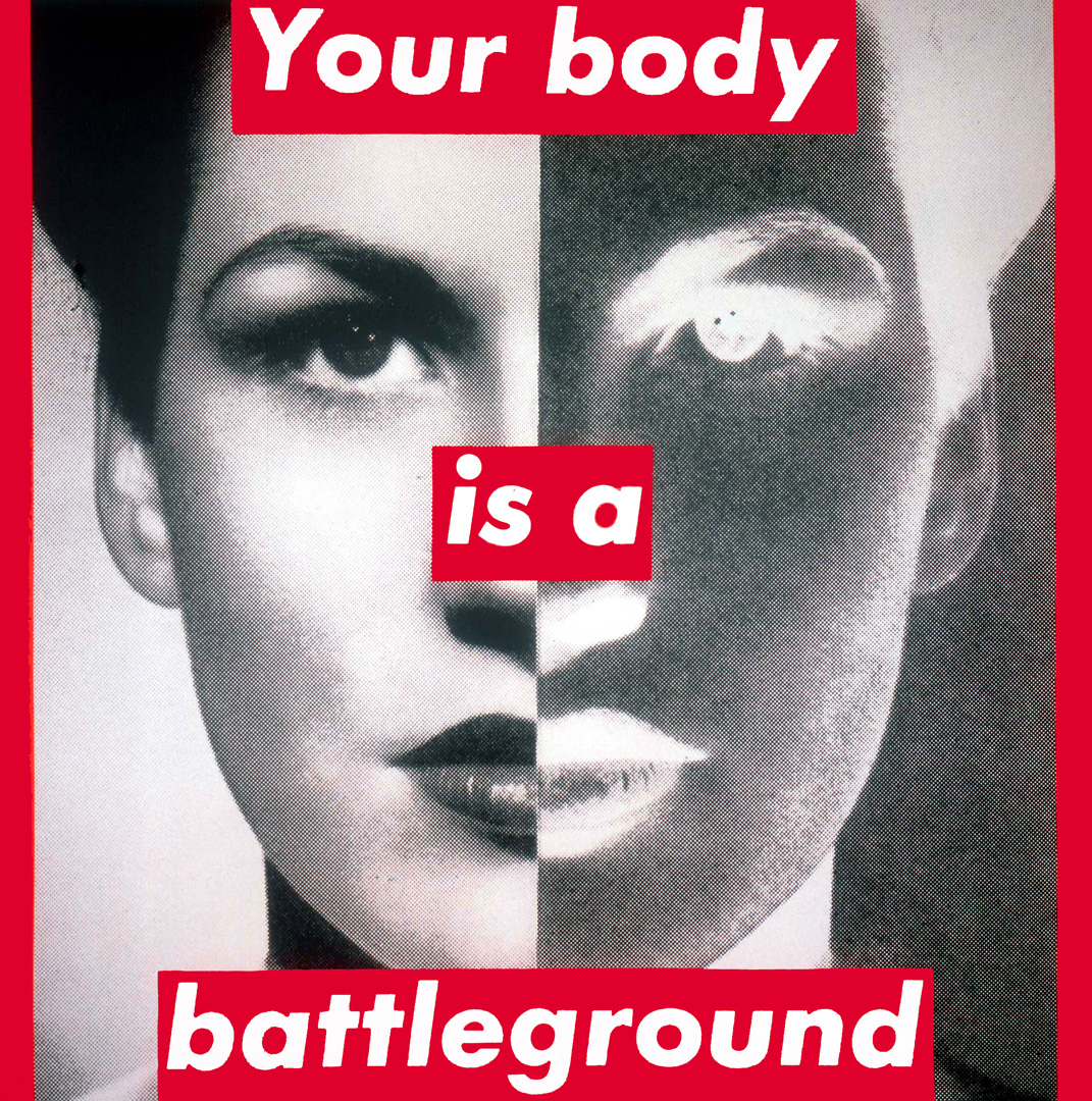
Your body is a Battleground – Barbara Kruger
Your body is a Battleground - Barbara Kruger 1989
As relevant now as it was 33 years ago. Barbara Kruger’s ‘Your Body is a Battleground’ was produced for the 1989 Women’s March on Washington, as America faced a real prospect of abortion rights being rolled back.
The poster features two halves of woman’s staring out, with both positive and negative exposures. With its stark message, it places women at the centre of the conversation, reinforcing how it is them who are being fought over.
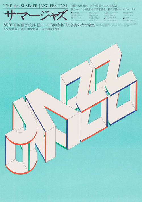
Summer Jazz poster - Igarashi Takenobu 1984
Let’s come full circle in this article by stressing once again that post-modernism wasn’t centred around one location, but was being employed by innovative artists across the globe. Takenobu is a great example of this.
Takenobu’s acclaim grew throughout the ‘80s, as he developed a distinctive style using axonometric alphabets in his designs (which you can clearly see in this stunning Summer Jazz poster).

Summer Jazz poster – Igarashi Takenobu
Post-modern design, an unrestrained artistic freedom
Post-modernism opened artists up to new freedoms and new ways of interpreting their medium. But even as they did this, the best post-modern designers of ‘80s still fell back on old artistic styles, simply moulding them to innovative new ways.
And, even as post-modern design took off in many different parts of the world and promoted an unrestrained artistic freedom, we see that many designers actually had shared motifs and themes in their work.
