A Legacy of Modern Desgin
Paul Rand’s influence is so powerful in the art world that he sometimes gets called “the father of graphic design.” And while this expression is somewhat reductive (graphic design exists long before Rand began working in the early 20th Century), it’s helpful due to the fact that it shows just how much modern design owes to this man.
Born in Brooklyn, in 1914, Rand developed an interest in visual art at an early age. Rand’s father, believing that he would never be able to make a living from pursuing art, was apprehensive about his fixation with art and tried to caution him not to get too invested in it. Design writers such as Michael Beirut have suggested that this may have been responsible for Rand going down the commercial route when he began to commit himself to learning – and practising – graphic design.
As a young adult, Rand honed his style in the interwar years, taking on small graphic design assignments while studying at several of New York’s most prestigious art institutions, including the Pratt Institute, Parsons, and the Art Students League. But most importantly, the artist – whose birth name was Peretz Rosenbaum – eschewed his Jewish identity and went with a name which he thought would appeal to the monocultural corporate world. The art academic Roy Behrens wrily notes that this persona was, in many ways, the “first corporate identity” that Rand created.
But it’s important to stress that while Paul Rand was gaining a burgeoning reputation during these years for rubbing shoulders with corporate suits and producing exemplary graphic design work for corporations, he was also building an aesthetic philosophy which he stood by throughout his career.
Rand was inspired by the philosopher John Dewey, who believed in the “functional-aesthetic perfection” of art. For Rand, the “functional” might mean the needs of the corporate entity that was paying him, while the “aesthetic” might mean the wedding of his own creativity with the needs of said corporation.
By the time Rand began designing the layouts of Apparel Magazine in 1936, he already had a distinctive graphic design style – based on his philosophical underpinnings – which he could impress employers with.
Reshaping The Corporate World
Rand’s most famous work took place in the 1950s and 1960s, when he was commissioned to create logos and visual identities for some of the biggest corporations in America (which, in that period, also meant the biggest corporations in the world).
It’s important to remember that, even as recently as 70 years ago, many of the biggest corporations weren’t immediately sold on the importance of visual designs. What did IBM’s corporate imagery have to do with selling something as revolutionary as a computer? How did a simple logo change help the Enron Corporation in the energy industry?
The reason that Paul Rand is sometimes called the “father of graphic design” is that he started a compelling conversation on corporate identity – one that convinced big businesses to follow his ideas.
Everyone in today’s world understands the importance of corporate logos, branding, and identity. These graphic symbols not only help with advertising and name recognition but, when they’re done right, they can be seared into the public consciousness like a cattle prod so that their influence is ubiquitous.
That is the legacy of Paul Rand. Beyond the artistry of his designs themselves, it’s the fact that he had the foresight to know just how pivotal they’d be for the businesses he worked with in decades to come.
Every graphic designer working in the corporate world today has in living in the shadow of the work that Paul Rand has done.
5 Famous Paul Rand Designs
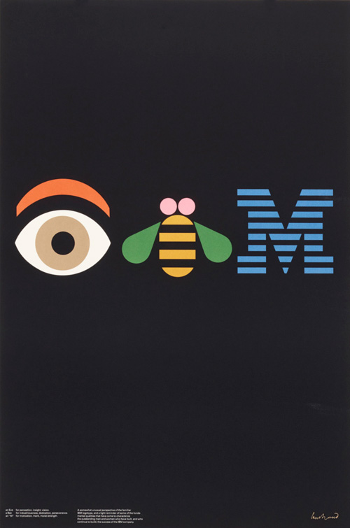
IBM
IBM - 1982
Not only did Paul Rand design logos for IBM from as early as 1956, he also acted as a graphic design consultant for them for over 30 years. The result of this was that when it came for IBM to update their logo in the early ‘80s, Rand was naturally called upon once again.
His design – a rebus which features an “eye”, a “bee” and the already-established lined “M” – was derided by IBM management. Despite the fact that they’d normally agreed to give Rand creative control when it came to design, this, they believed, was a step too far – a farce that verged on mockery and silliness.
But the logo prevailed, and eventually became accepted by the company. Because although it was challenging to the narrow mindset of a multinational corporation, a general understanding emerged that Rand was trying to bring a soft and humane element to the strictures of a tired, now-monotonous big corporation logo.
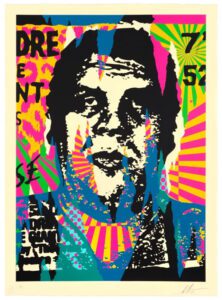
No Way Out - 1950
We’ll start off with a poster which reinforces the fact that Rand, like any freelance graphic designer, was very much a gun-for-hire, so his work saw him being involved with numerous different projects.
In this poster, created for the 1950 crime-noir film No Way Out, Rand shows his learning of – and appreciation for – some of modern art’s best-known movements. The rough assemblage of blocks, colours, and photography all suggest an homage to constructivist posters of 1920s Russia (although this poster is far more subtle and therefore more palatable to an American audience!)

No Way Out
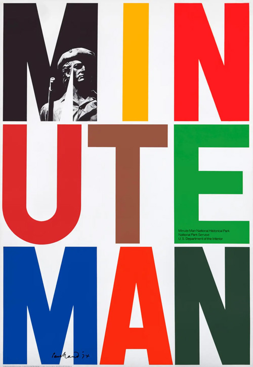
Minute Man National Historic Park
Minute Man National Historic Park - 1975
As exemplified by the IBM, Enron and ABC logos, Rand was a master when it came to evocative typography. Here, he creates a poster to commemorate the bicentennial of the American War of Independence, which had its first battle at what is now the Minute Man National Historic Park.
Look at the brilliant geometric shapes that Rand creates on the poster and enlivens with colour contrasts. He even manages to fit in an image of a famous statute from the Park, bringing tradition to this modernist design.
Interfaith Day - 1943
Behind the corporate graphic designer, salesman, freelancer, and entrepreneurial artist, Paul Rand’s various ‘Interfaith Day’ posters reveal a more delicate side of him.
The posters were used to promote New York’s Interfaith Day, which celebrated peace and tolerance in the city (the context of it being the year 1943 and Rand being a Jewish person is useful here – for obvious reasons).
His poster for this event features a minimal rendering of a rooster (perhaps calling for peace), with economical use of colour.

Interfaith Day

UCLA Summer Sessions ’93
UCLA Summer Sessions '93 - 1993
By 1993, Paul Rand was almost 80 years old and very much a legend in the art world. This was the context for when he was asked to create the poster for UCLA’s summer programme.
It’s textbook Paul Rand, from the pleasing symmetry to the clear typography to the economical but impactful use of colour.
The long shadow cast by Paul Rand’s art
When asked about his work for UCLA and why it had been so beneficial for both parties, Rand replied simply: “I do the job, and they accept it.”
What’s interesting about this quote is that it reminds us of one of the main tensions present in Rand’s – and every graphic designer’s – careers.
What, exactly, is the nature of the “job” that graphic designers do in the corporate world? Is it to solely follow their own creativity and compel the commissioning party to accept it? Or is it to compromise their ideas for another person’s or business’ demands?
Every designer/commissioner has wrestled with these questions at some stage. But Paul Rand’s pioneering work meant that there’s a blueprint for how this type of work can be mutually beneficial – and even downright exciting.
In today’s world, from app logos to sportswear, from restaurant franchises to insurance branding, every successful graphic design project in the corporate world owes a small debt to Paul Rand…