An art form, within an art form
Typography in posters has come a long, long way in the last 125 years.
Big developments were made in this art-form-within-an-art-form long before computers ever existed, with the commercial era offering new opportunities for artists to play around with text and learn how it could be more appealing as with a poster design itself.
Here are 9 posters which can tell us more about typography in posters:
Schweiz – Herbert Matter 1934
In the early part of the 20th Century, more and more graphic designers and artists were beginning to consider the importance of typography in their designs.
With society’s visual landscape becoming saturated by mass media, and with international, multi-lingual trade growing, many designers felt that there was a need for sleek, clear, bold typography that got across a message – while also being visually appealing.
Matter was among several artists who are credited with pushing forward the ‘Swiss Style’ of design typography, which placed a new focus on type as an integral, functioning part of the design.
In this poster, commissioned by the Swiss Tourism Board, Matter makes use of photomontage and dynamic depictions of skiing. But look at how unique the typeface is. With Matter’s unique sans-serif style, the ‘SCHWEIZ’ here becomes less of a word, and more of an emblem.
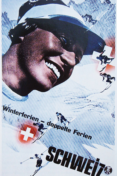
Schweiz – Herbert Matter
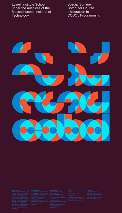
Cobol – Dietmar Winkler
Cobol – Dietmar Winkler 1969
Having worked at the MIT Office of Design, Dietmar Winkler was one of several artists who propagated the ‘MIT Style’, which featured noted characteristics such as bold geometric forms, innovative typography, and contrasting planes of colour.
Winkley designed the ‘Cobol’ poster in 1969, as an advertisement for M.I.T.’s summer computer course in Cobol programming. In doing so, he left a significant contribution to the visual architecture of computers, which has remained to the present day.
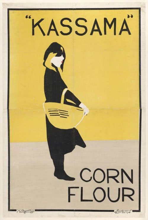
Kassama Corn Flour - The Beggarstaffs 1894
According to the V&A Art Museum, the Beggarstaffs (brothers-in-law James Pryde and William Newzam Prior Nicholson) assumed full artistic control over their designs, whether they were for commercial purposes or not, and they had no qualms about not actually referencing the products they were being commissioned to advertise. This is very much the case with their Kassama Corn Flour poster advertisement.
So why does this poster do so well as both an ad and an art piece?
Well, for a product as run-of-the-mill as corn flour (pun intended), potential customers would have wanted clear, direct information. The flat colours, minimal style, and – most importantly – the sans-serif typography gives you everything you need to know.

Kassama Corn Flour – The Beggarstaffs
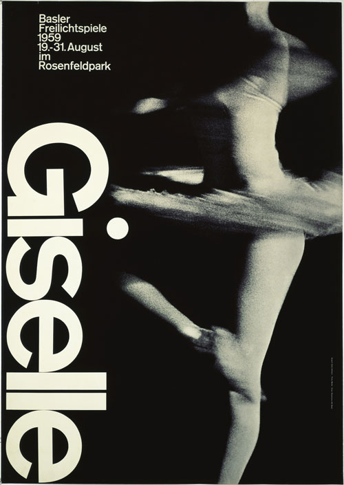
Giselle – Armin Hoffman
Giselle – Armin Hoffman 1959
Like Herbert Matter, Armin Hoffman shared a belief in the benefits of the ‘Swiss Style’, with clear but visually appealing messages that tried to hide the artist’s subjectivity and focus purely on the poster’s message and how it would readily be perceived.
This comes across wonderfully in ‘Giselle’, which was created in 1959 for the Basler Freilichtspiele (Basel Open-Air Theatre) in Switzerland, and which has had many imitators over the last 60 years.
The photo of the dancer – blurred in mid-pirouette – hints at the professionalism, artistry, and experience of the dancers. It is complemented beautifully by the typography, which is simple and reserved, yet spatially dominating as it descends vertically on the left-hand side.
Here, ‘Giselle’ – as a piece of text – suggests a brand name, an identity, all without Hoffman needing to say more.
Priester – Lucien Bernhard 1905
Art historians have long chronicled the importance of Lucian Bernhard for the design world. He is credited with having spawned the Plakastil (poster style) movement, which is said to have revolutionised the ad world by its preference for stark imagery and minimal letting, which was markedly different from the complexity of other art forms of that era – in particular, Art Nouveau.
‘Priester’ was designed for a competition sponsored by Berlin’s Priester Matches Company, and Bernhard won this competition at the age of 18.
The beauty of this poster is in both the minimal depictions of the matches and the inventive typography. The lettering is heavy, blocky, and impossible to miss, while the background is entirely black.
While it might not have had the ornateness of an Art Nouveau piece, the typography helps this work as both poster and logo; and both advert and emblem.
Many would take their cue from these ideas.
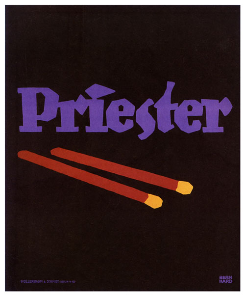
Priester – Lucien Bernhard

Bauhaus Exhibition – Joost Schmidt
Bauhaus Exhibition – Joost Schmidt 1923
Considered one of the most influential artists of his era, Joost Schmidt was a teacher at the Bauhaus, a school in Weimar Germany which sought to challenge and elevate public perceptions of art and design.
This poster, which was created for a competition was which was exhibited at the Bauhaus Exhibition in 1923, has been a source of fascination for poster lovers and art historians for almost 100 years… It was considered daring in its geometric design, giving an insight into the ideas and structures that Art Deco artists were having.
Schmidt moulds these boldly-coloured shapes to look like cogs in a machine or an architectural blueprint. In doing so, he also twists and interweaves the text into this complex architecture, making it part of the machine.
The remarkableness of this poster is in how your eyes are drawn to each part of it – each block of text – like a mechanic might look at different parts of an engine to understand it.
Woodstock Music and Art Fair - Arnold Skolnick 1969
Music festival posters are fairly rigid and formulaic in terms of their design these days, with most simply laying out the performers and other necessary information.
But go back sixty years or so, and music posters are an integral part in suggesting to audiences the feel of a festival before punters decided to buy tickets.
Artist Arnold Skolnick was drafted in to make the Woodstock Music and Art Fair poster after the organisers decided they were unhappy with the original poster that they’d commissioned – a garish, overly ornate design that was overstuffed with psychedelic and classical imagery.
Skolnick’s design was minimal and beautifully balanced. The soft colours and minimal depiction of the bird on the guitar suggest the festival’s pastoral setting, while the typography aims for a symmetry, clarity, and austerity that let the list of major artist names do the talking.
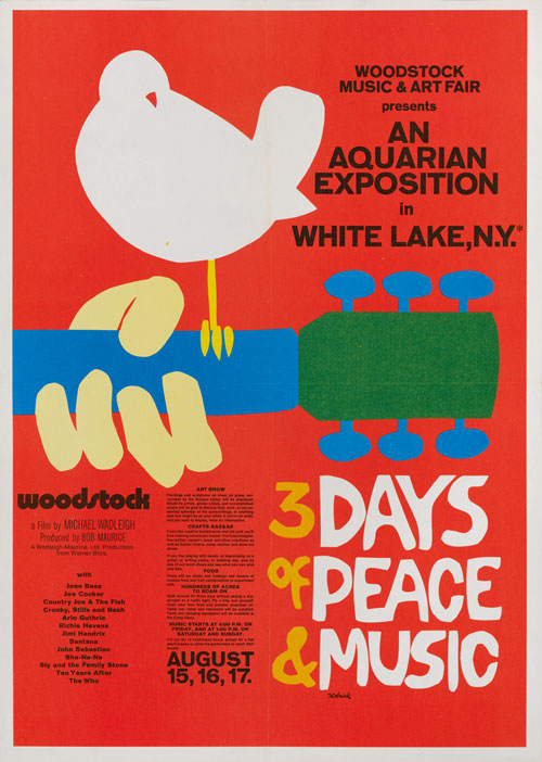
Woodstock Music and Art Fair – Arnold Skolnick

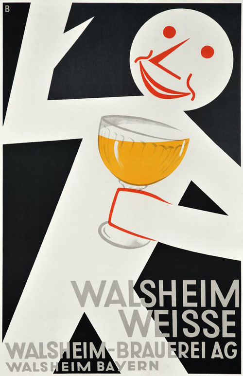
Walsheim Weisse – Otto Baumberger
Walsheim Weisse – Otto Baumberger 1932
Otto Baumberger was a Swiss painter and poster artist who designed hundreds of posters during his career. Like many of the best Swiss poster artists of his time, Baumberger created designs which were aimed at tourists – with the Alps often serving as his inspiration.
Walsheim Weisse was a poster used to promote Walsheim alcohol drinks. In this poster, Baumberger eschews things that other poster designers might’ve considered important – such as having a bar or party as a backdrop, or any significant branding.
Instead, Baumberger uses a clear, sans serif, grey typeface as a complement to the simple image of a man who is, without context, happy with his beer.
Baumberger appears to challenge us – and his 1930s audience – with the straightforward question, “What’s better than this?”
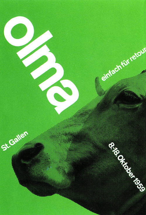
Olma the Cow - Josef Müller-Brockmann 1959
Made for the Annual Agricultural Fair in St Gallen, Switzerland, Müller-Brockmann’s famous poster is another great example of the developments of the Swiss Style/International Typographic Style.
Like other Swiss Stylists, Müller-Brockmann’s main aim was for clarity, minimalism, and economy concerning the design process.
But the text is actually what makes this poster so interesting – the sans-serif typeface is beautifully clear, while the geometry, placement, and varying sizes of the text sections all draw the eye in different directions.

Olma the Cow – Josef Müller-Brockmann
Typography in posters adds to the visual appeal
The online space offers thousands of different, original typefaces, which speaks to the continuing fascination that graphic designers have with typography.
Much of this stems from the innovations of poster design throughout the 20th Century, with many artists learning how original typographic ideas could aid in the visual appeal, clarity, and economy of a poster.
