Vintage Travel Posters - Trains, planes, and automobiles
With the introduction of new forms of technology and faster modes of transport, the 20th Century presented new opportunities for the general public to travel – both for business and pleasure.
Trains, planes, and automobiles all become more affordable – and therefore more popular – in these years, and recreational holidaying became a new opportunity for the public.
But this opportunity came with challenges for tourism boards, travel companies, and local and national governments. How do you convince people that your country or region is more worth visiting than another, similarly accessible, country or region?
For many organisations, the answer was simple: eye-catching posters.
The early 20th Century saw the creation of some brilliant vintage travel posters, with artists being called in to work their magic on capturing the essence of a tourist hotspot.
Some of the most memorable travel posters have even been turned into vintage prints which are still iconic today, and which you might see displayed everywhere from museums to social venues.
Here’s a look at some of the best vintage travel posters of the 20th Century:
Frankfurt Internationale Einfuhr-Messe - Ludwig Hohlwein (1919)
After the horrors of the First World War, Germany rapidly tried to reinvent itself and redefine its image internationally. Ludwig Hohlwein’s poster, used to promote the first International Import Fair since the War, was one of many that tried to present the dazzling, reimagined face of the country.
Hohlwein was a pioneer of the Sachplakat style of design, which favoured minimal, simplified shapes, bold colours, and striking lettering. Here, we see a train towering over the ground as it crosses a bridge, dropping flyers which – as the eye follows them down – appear to be national flags of countries participating in the Fair.
With its modern design, its brilliant use of colours, and the fact that it’s geared towards an international audience, it found itself becoming one of the most iconic vintage travel posters.
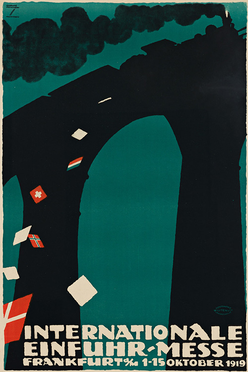
Frankfurt Internationale Einfuhr-Messe – Ludwig Hohlwein
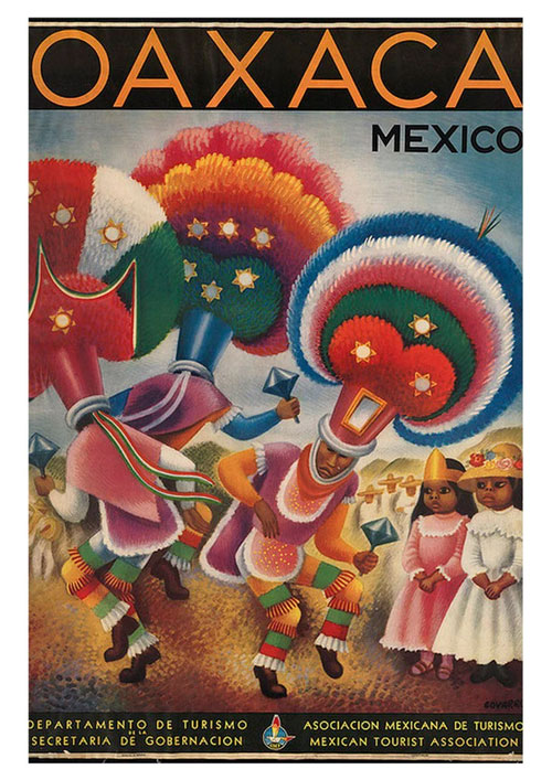
Oaxaca – Miguel Covarrubias
Oaxaca - Miguel Covarrubias (1942)
The Mexican city of Oaxaca went through major infrastructure regeneration projects in the 1940s and 1950s, with local government trying to reshape the city. Miguel Covarrubias’ travel poster is a beautiful insight into how the city wanted to be seen by visitors.
Note the bright colours, the unique facial expressions, the incredibly elaborate dresswear, and the way the shapes hint at unusual dance moves. Everything is designed to create a sense of wonder and otherness in the viewer, as well as a sense that every part of this scene (and therefore, every part of the city) is alive.
For travellers looking for somewhere that was exotic, this would’ve made an enticing prospect.
TWA New York - David Klein (1958)
David Klein was one of the foremost advertising artists of his era, with many of his designs helping to define the era known today as the ‘Jet Age’ (meaning the 1950s and 1960s – when air travel was becoming more popular).
Klein’s work for TWA (Trans World Airlines) gained massive recognition during its time, with many of his posters gaining critical acclaim, as well as being a hit with viewers and advertisers alike.
TWA New York is one of Klein’s most famous posters and gives an insight into the precise beauty of his work. Look at how Time Square is rendered minimally, but how the shapes dance together in a way that makes the whole poster seem very involved.
On top of that, look at how the proportions guide your eyes toward the centre of the poster – just by looking at it, you feel like you’re already there.
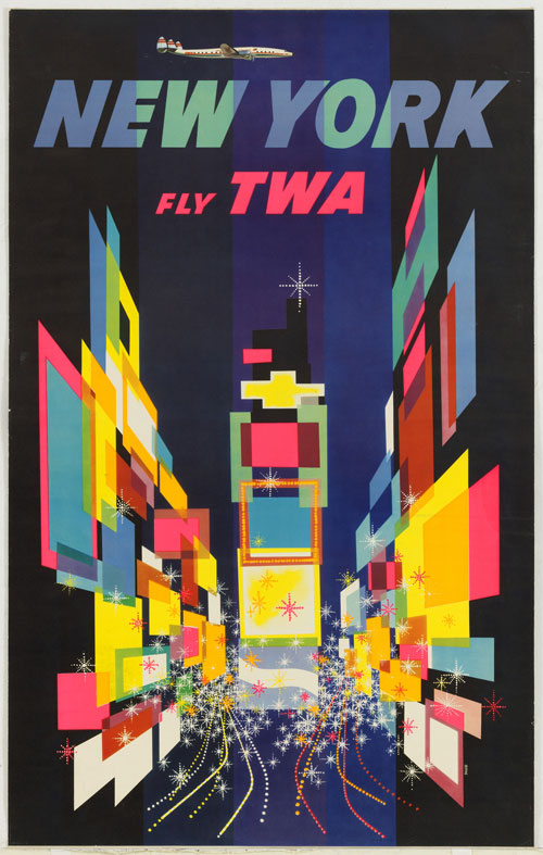
TWA New York – David Klein
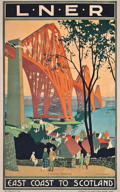
East Coast to Scotland – Henry George Gawthorn
East Coast to Scotland - Henry George Gawthorn (1920s)
Henry George Gawthorn began his professional career as an architect, studying at Regent Street Polytechnic. He later began working as a commercial artist for train company LNER (for whom he designed this poster).
And look at how architecture plays a sizeable role in his posters. In this delightful image, Gawthorn weds manmade achievements (like bridges and boats) with their beautiful natural surroundings – all while keeping humans in the centre of things. In the industrialised 20th Century, Gawthorn was making a point that bridges, towns, and boats aren’t just functional – they’re tourist attractions in and of themselves.
The Great Barrier Reef - Gert Sellheim (1930s)
Featuring an eye-catching art deco style, Gert Sellheim’s poster promoting the Great Barrier Reef was made for the Australian National Travel Association. It’s memorable in its symmetry – with the three fish, three islands, and three palm trees all sitting perfectly together on the poster.
From this poster’s vantage point, we get a view of Australia as suitably exotic, tropical, and bursting with unusual fauna.
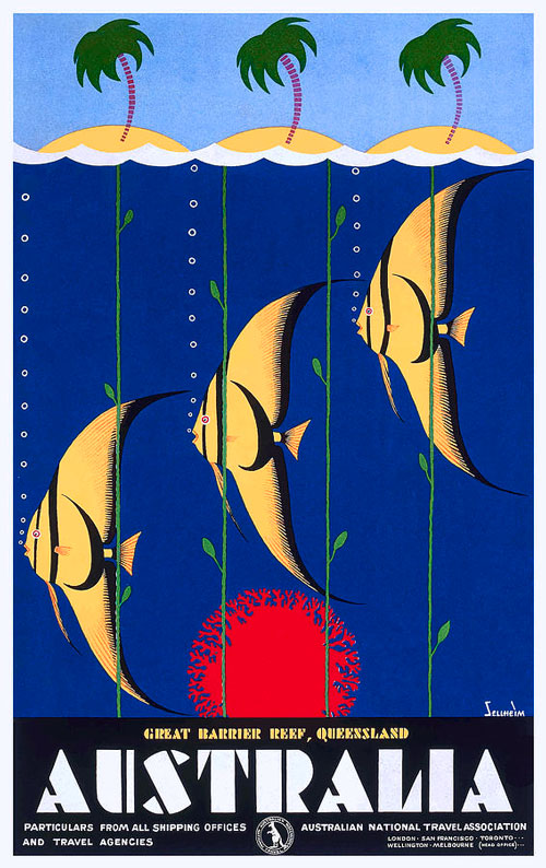
The Great Barrier Reef – Gert Sellheim
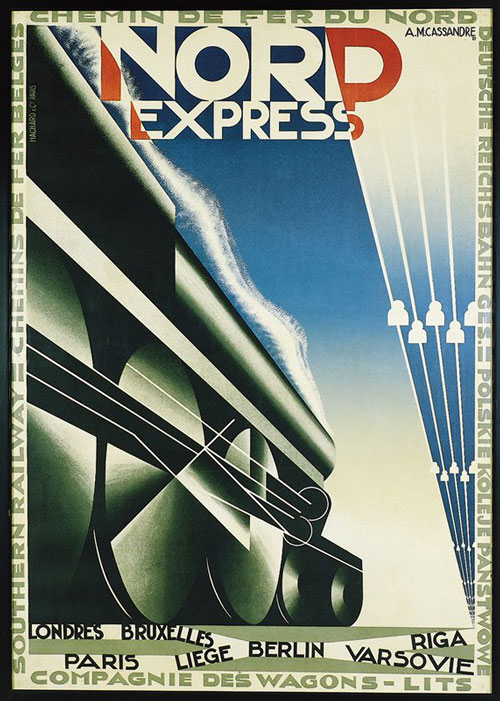
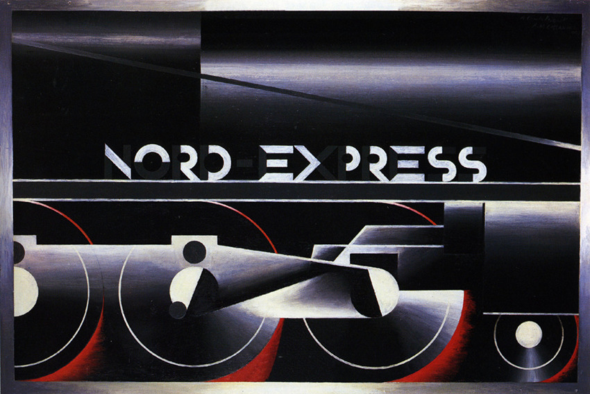
Nord Express – A.M. Cassandre
Nord Express - A.M. Cassandre (1927)
In the inter-war period, travel companies and transport businesses tried their hardest to showcase themselves as modern and cross-continental, because they wanted people to feel confident about taking themselves off again on a holiday or an adventure.
The Nord Express was a train service that operated deluxe carriages, sleeping-cars, and dining all over Europe. Their advertising poster, designed by Adolphe Mouron Cassandre, shows a stylised depiction of a train heading off into the horizon, with smoke billowing above it and a sharp blue sky above.
In an attempt to advertise a sleek, modern transport experience, it utilises modern artist movements like Cubism and Art Deco.
Bretagne - Roland Goujon (1939)
Created for SNCF, the French state-run train company, artist Richard Goujon presented a unique, modern art depiction of the French province of Bretagne (Brittany). Worth noting here is the local clothing and how the people in the image appear to be participating in a local custom – Goujon’s image hints at nostalgia and local heritage with his quaint (possibly dated) depiction. Goujon perhaps knew that when it comes to travel advertising, quaintness and local heritage are very much part of the appeal and part of the sell.
Another thing worth noting here is how the green, rocky, and sometimes rolling landscapes of Brittany are reflected in the unusual geometry in the backdrop of this poster.
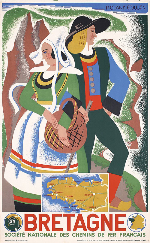
Bretagne – Roland Goujon
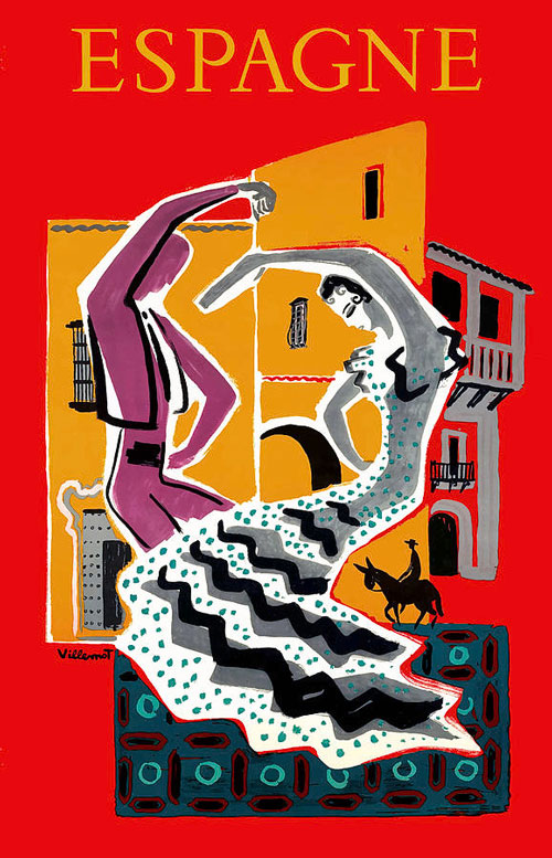
Espagne (Flamenco) – Bernard Villemot
Espagne (Flamenco) - Bernard Villemot (1953)
With flamenco dancers having become symbolic representations of what many consider to be ‘authentic’ Spanish culture, they featured prominently in Bernard Villemot’s striking travel poster Espagne (as the name suggests, it was used to market Spain to the French public).
Villemont values experience over location, as he chooses not to focus on any well-known landmarks, preferring to draw upon certain tourist expectations of Spain. While the flamenco dancers are brilliantly animated here, it could be argued that not everything on the poster is effective – in particular, the Don Quixote-esque image of a man on his horse feels forced and incongruous.
Air France, Europe - Jean Carlu (1958)
Carlu’s 1958 poster, which features strong graphics, bold colours, cubism-esque shapes, and a minimal design, all present an incredibly unique depiction of France – most likely designed to resemble the feeling of seeing the quiet countryside from a plane.
So how effective is it as a travel poster? Well, by the 1950s, airlines were trying to market themselves as not just for wealthy tourists, or those on business – they were a mode of transport for everyone from every part of the country. This poster perhaps suggests that Air France wanted to present itself as a company that understood the real France – meaning the quiet countryside – as well as the glitzy tourist version.
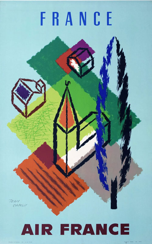
Air France, Europe – Jean Carlu
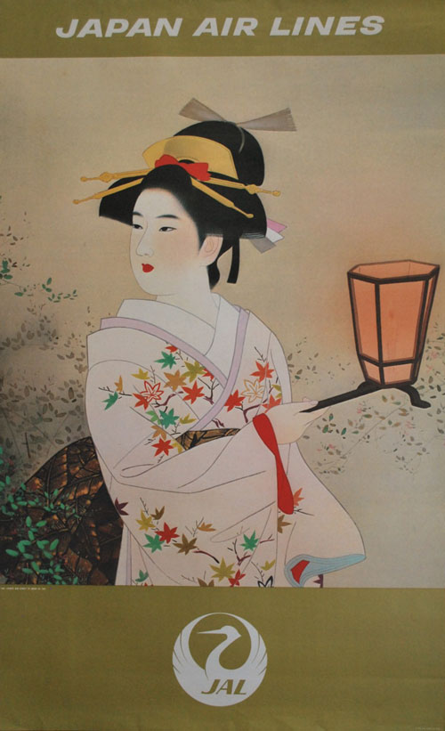
Japan Airlines, Japan – Shinsui Itō
Japan Airlines, Japan - Shinsui Itō (1970)
For certain artists, their travel artistry goes beyond just being promotional or commercial – it’s part of a wider attempt to fashion a national identity.
Such is the case with Shinsui Itō and his work. Itō was one of the most respected artists in Japan post-WWII, and he was a pioneer of the shin-hanga art movement, which revitalised traditional art.
The hallmarks of shin-hanga are everywhere in this 1970 poster, created for Japan Airlines. By using Itō, it was clear that Japan Airlines were trying to market a new version of Japanese identity both to tourists and to locals.
The persuasive implication: fly with us and it’ll help you on your journey to accessing authentic Japanese culture.
Rio Brazil, ‘Wonderful City’ - Joa (1950)
When posters are done brilliantly, you often forget how much intricacy lies behind a seemingly simple design. In Joa’s image, everything from the Copacabana’s winding boardwalk, to the stunning peaks of the Corcovado and Sugarloaf mountains, are present in a poster that still manages to be decidedly uncluttered.
It’s really effective in its shaping, too. Look at how the letters of ‘Rio’ slope from left to right, suggesting forward momentum. As your eye reaches the right-hand side of the poster, mentally it feels like you’ve already packed your bags…
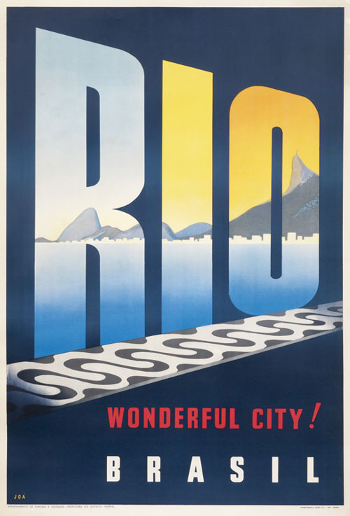
Rio Brazil, ‘Wonderful City’ – Joa
Effective poster designs helped sell travelling experiences to the public
One thing which all of the posters above share is that they prioritise a travel experience, rather than presenting a perfectly rendered depiction of well-known tourist areas or landmarks.
The reasoning? Anyone could look at a photo – but the right poster could be compelling enough to make you book a train or plane ticket.
That’s why many of these famous vintage travel posters have earned their lasting place in art history.
